Branding · Identity · 2023
GM Syntex
The Brief
A legacy in fabric, redrawn from within.
GM Syntex had spent over two decades building a position in the textile industry: as a manufacturer, a supplier, and a name the trade already knows. The brief was not to announce them. It was to give design language to something that had been earned in practice but never clearly expressed.

The Approach
Patterning logic.
B2B branding asks a different question than consumer work. You're not seducing someone at a shelf — you're earning the confidence of someone who already knows the industry, probably better than you do. Dalbir Singh, the founder, put it plainly: the identity had to feel like it had always existed. Not new. Not cool. Timeless.
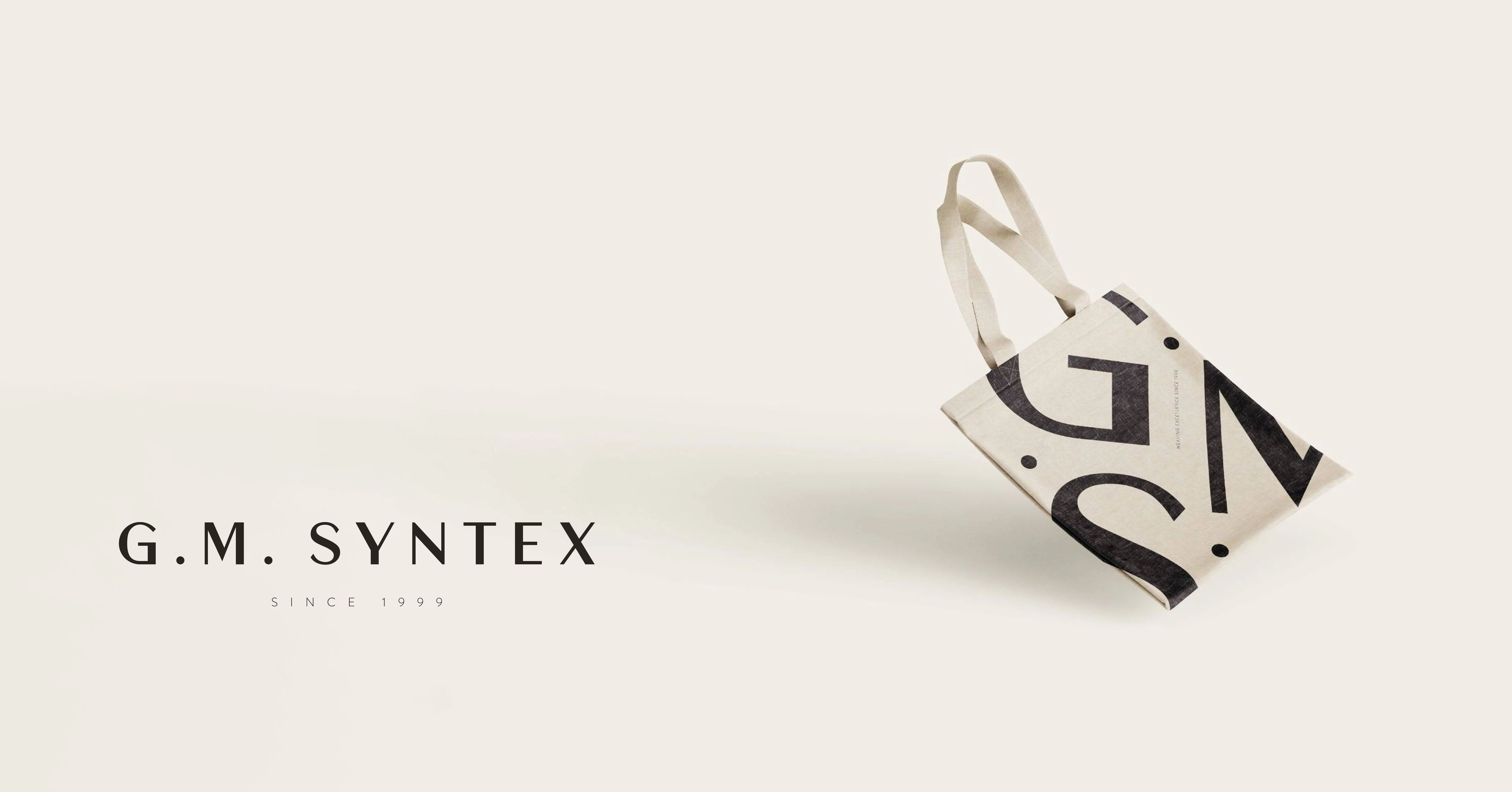
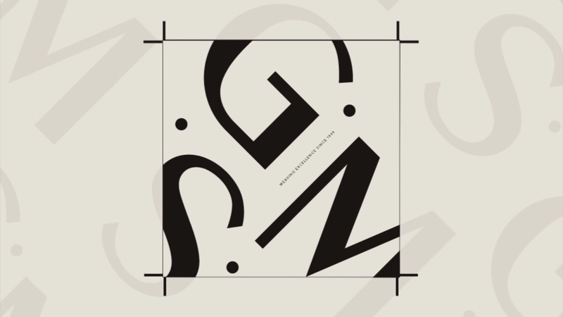
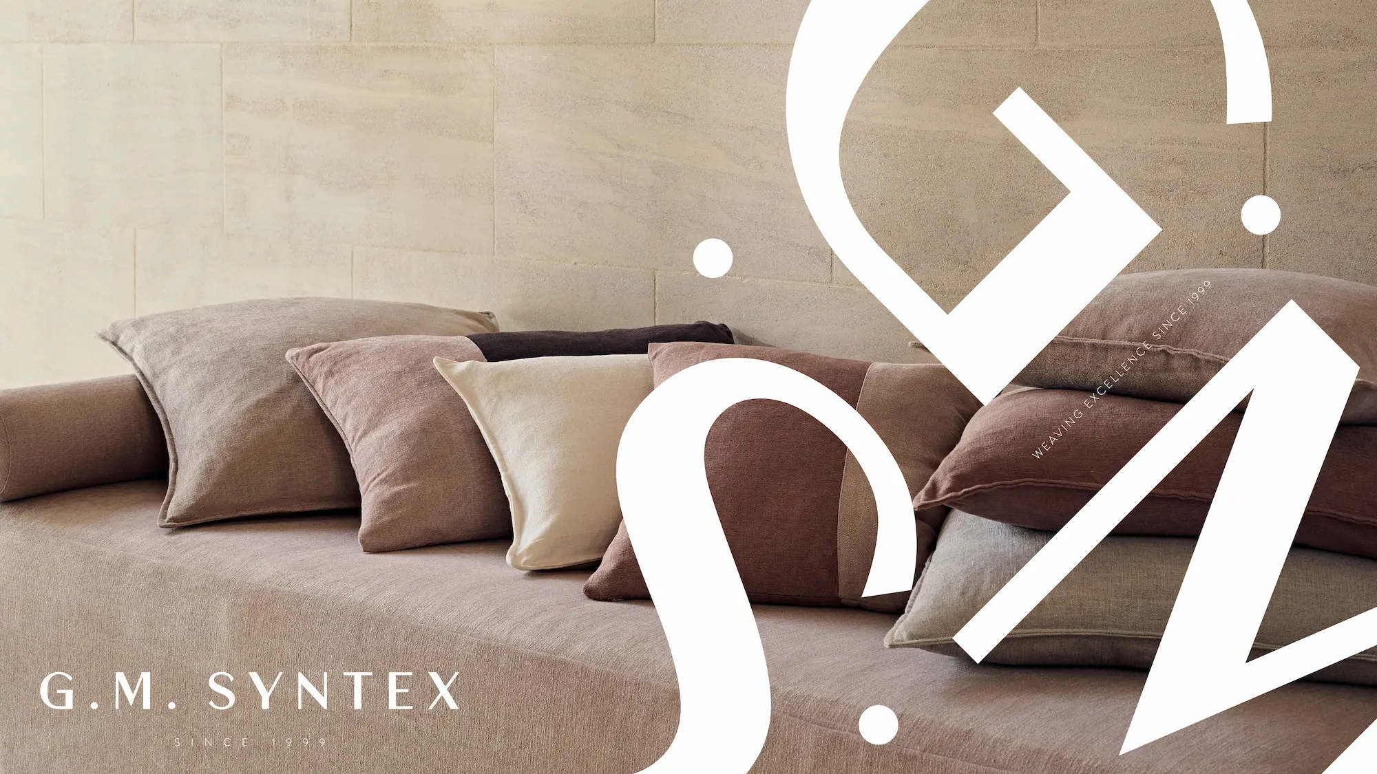
The monogram came from the factory floor. On one of the embroidery machines, a fabric with an abstract repeat pattern was running. The logic of repeat and crop that textile design runs on, that logic transferred. The GMS letterforms were built using the same principle: a pattern developed from the letters, then cropped like a swatch cut from cloth. The monogram is exactly that: a crop. It uses the same typeface as the wordmark, so either holds alone without reducing the other.
Dalbir Singh's feedback on an earlier direction — where we had softened certain letterforms to bring in the motif of fabric — closed the question entirely. No curves. Nothing that reads as trying. The all-caps wordmark, the settled typeface, the restraint: all of it came from understanding what B2B legacy actually asks for.
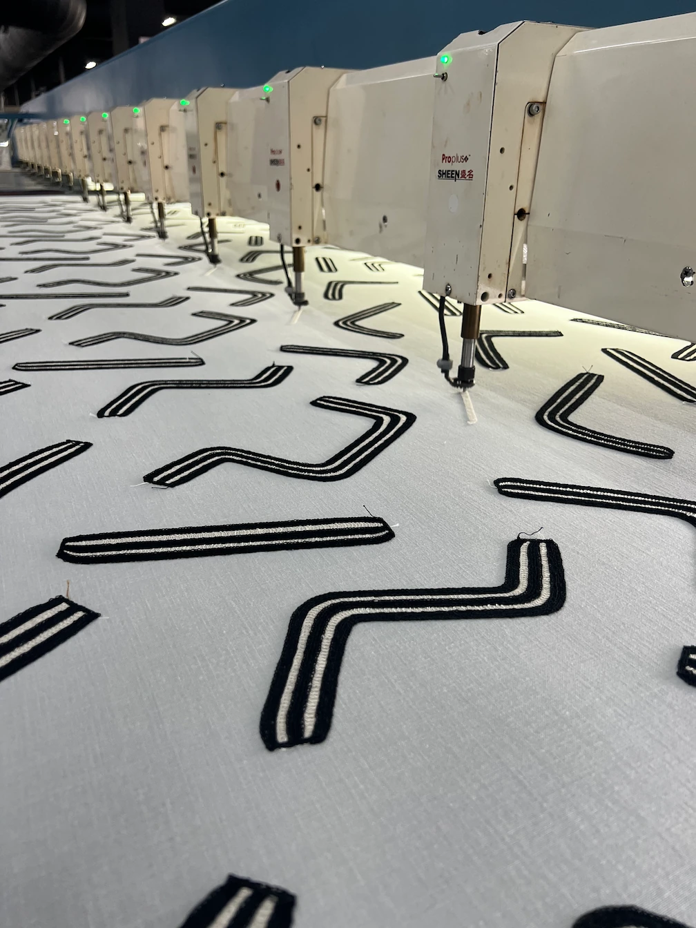
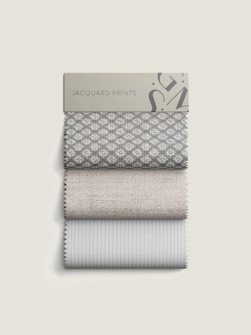
A fabric running on the embroidery machine during the factory visit. The repeat-and-crop logic of this pattern is what the GMS monogram was built from.
The System
One mark.
Every surface.
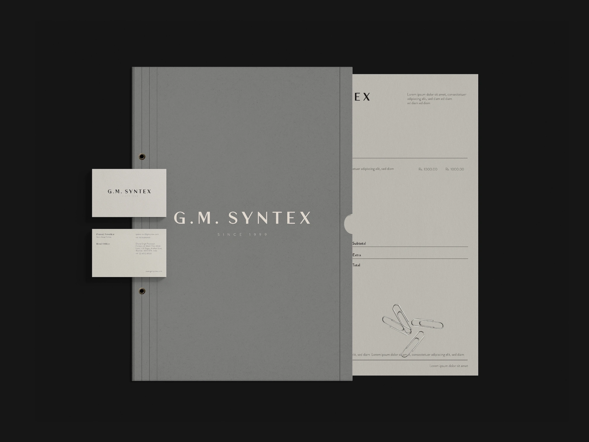
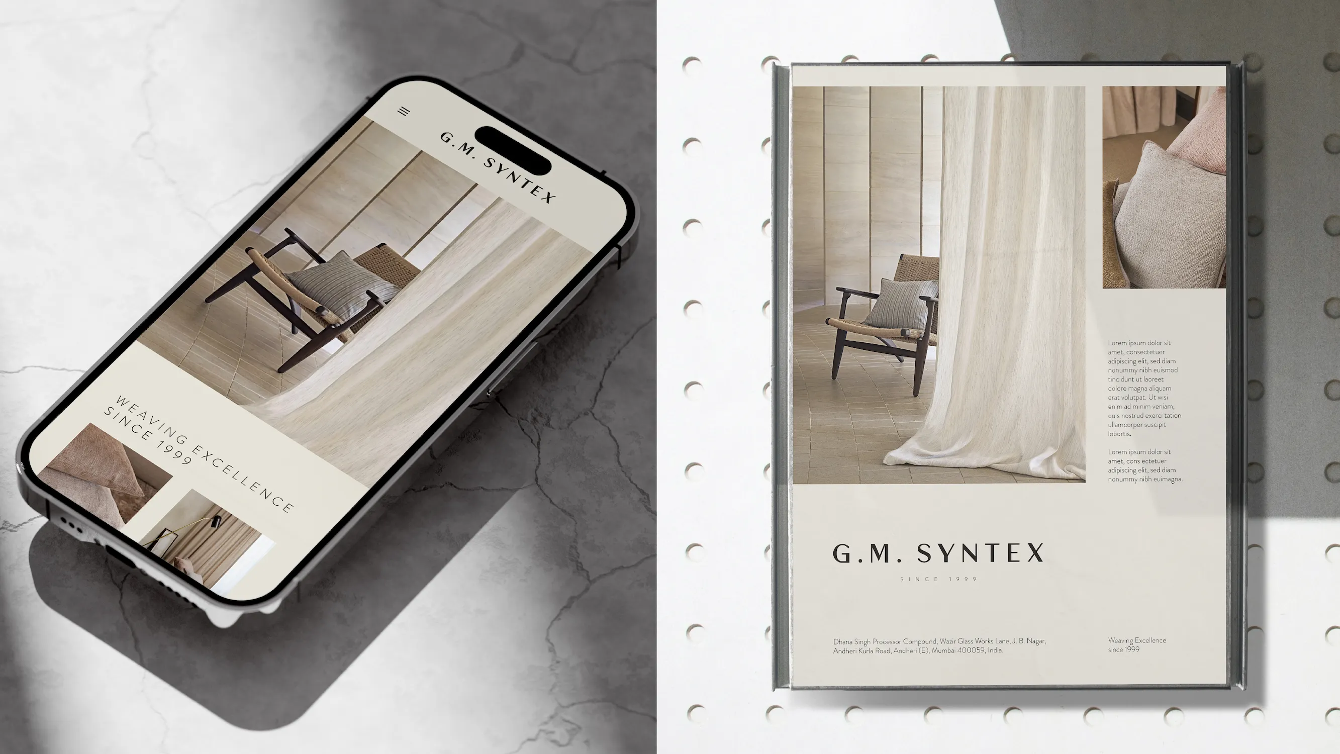
A B2B brand lives on business cards, letterheads, truck panels, and trade fair stands. The system was built to hold across all of it: legible at 10mm, commanding at 10 metres. The monogram and wordmark share a typeface — either works alone, neither undermines the other.
Since Launch
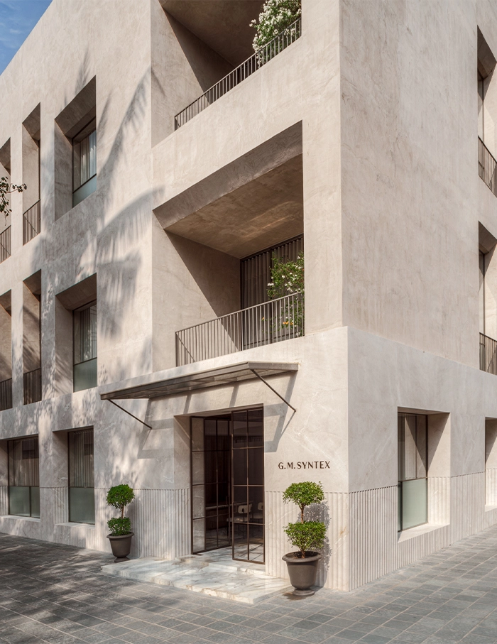
The brand and the building opened together.
The office renovation ran in parallel with the identity. Architects and the brand team shared palettes and materials throughout — the space took cues from the brand, the brand held its ground in the space. To me, the result is the most complete physical expression of the identity: not a branded environment, but a place that simply looks like GM Syntex.
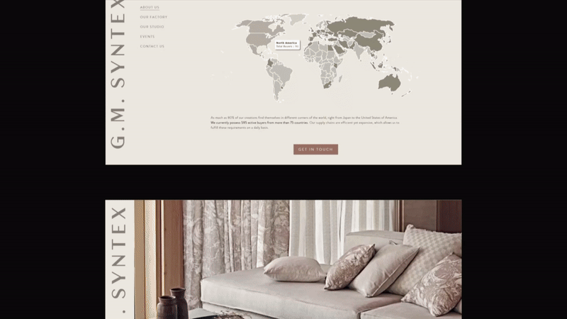
GM Syntex appeared at Heimtextil 2023 — one of the largest home textile trade fairs in the world — carrying the new identity into an international B2B context it was built for. The company now serves 595 active buyers across 75 countries, with 80% of production going to export.
The brief was to make the brand feel like it had always existed. Three years on, I believe it does.
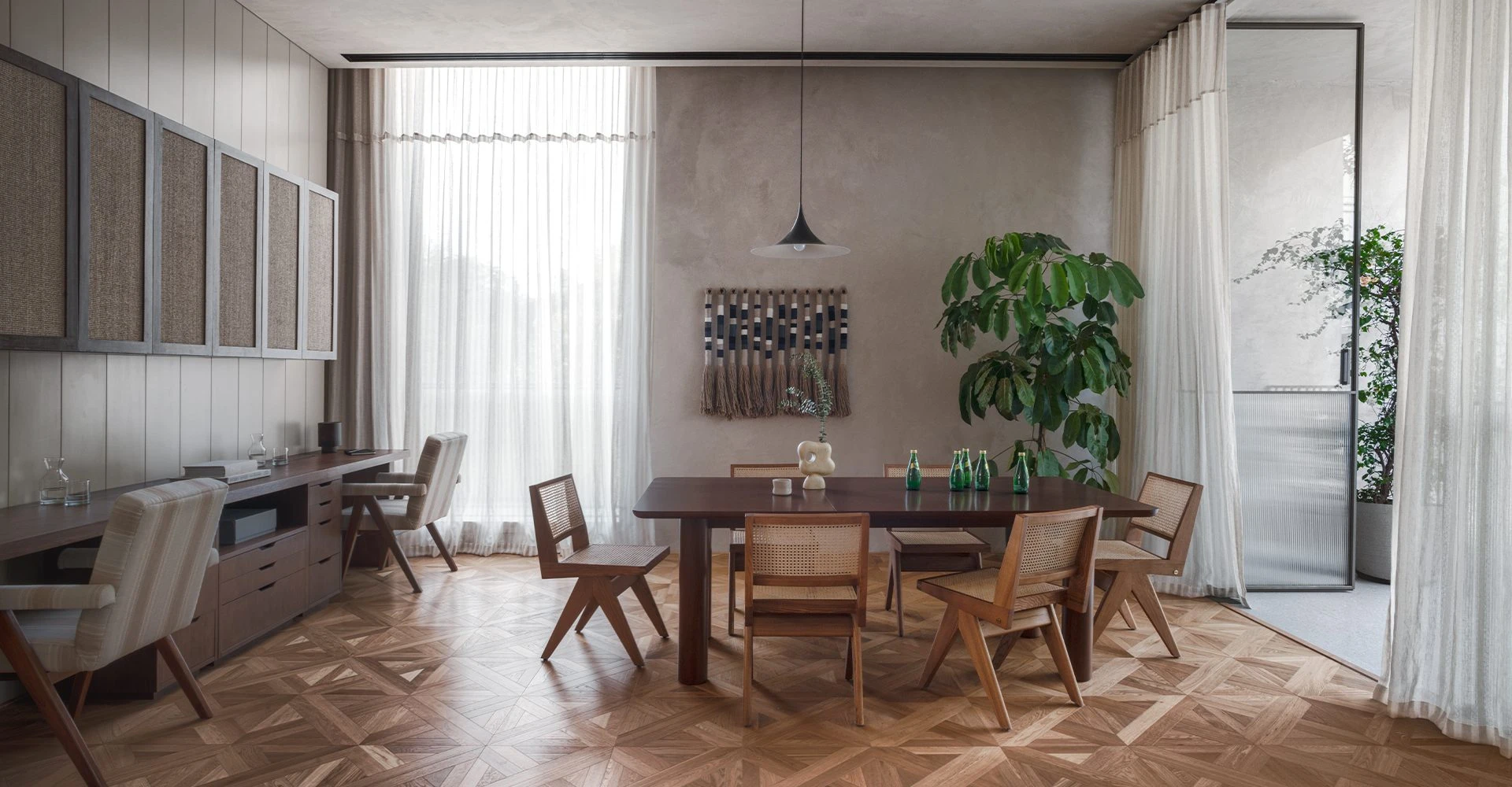
The G.M. Syntex office reopened shortly after the rebrand. Developed in parallel with the identity — in collaboration with the founders and architects — the space is the brand's most complete physical expression.
Credits
- Creative Strategy & Brand Design Lead Abhinav Pahade
- Creative Director Shrey Bhatt
- Brand Strategy & Copywriting Aditya