BackBay2025
Art replaced
the glass bottle.
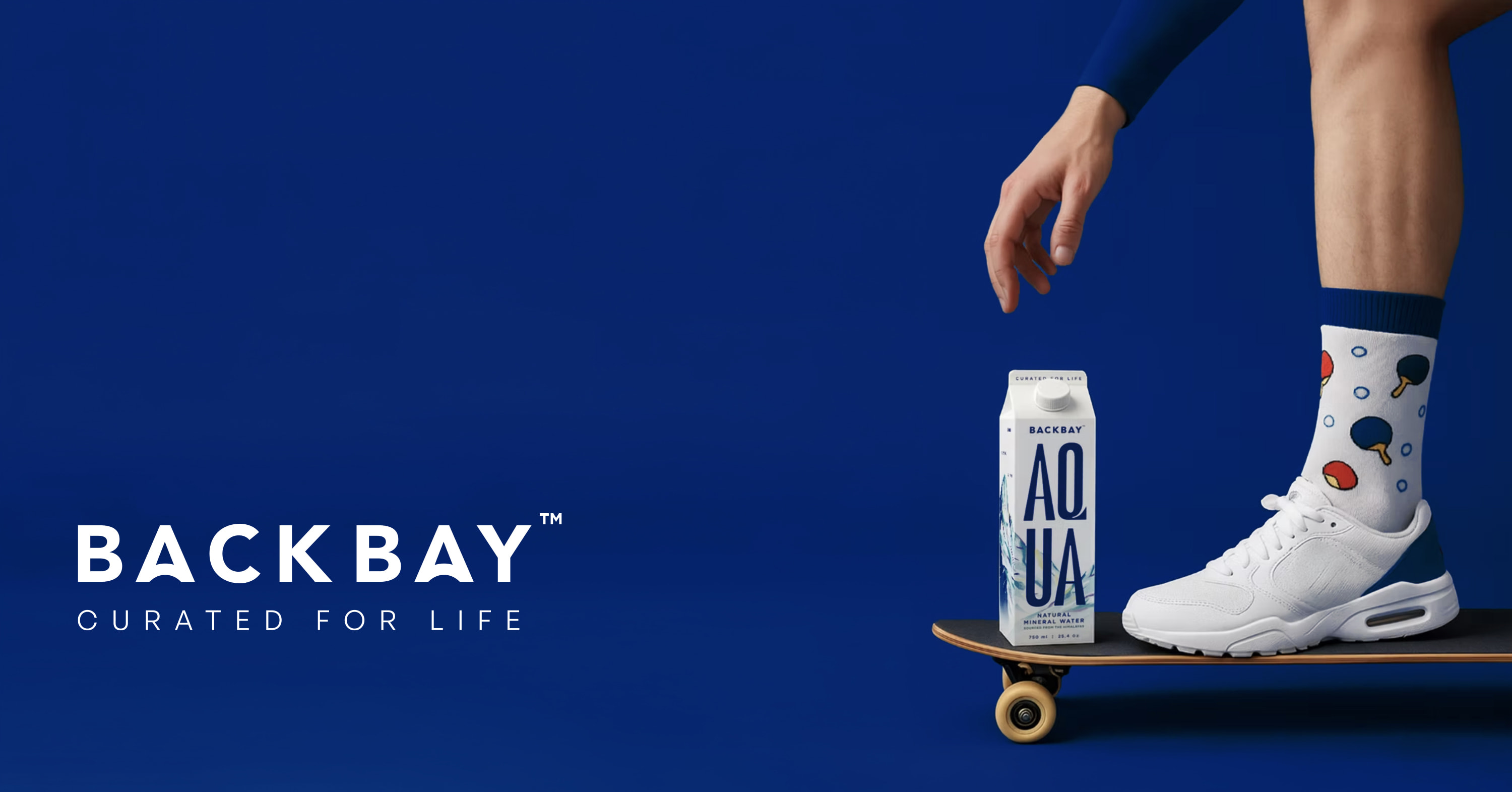
Premium mineral water in a tetra carton, up against glass bottles at ten times the price of regular water. We built the parent brand, its first pack and the film that launched it.
Premium mineral water in a tetra carton, up against glass bottles at ten times the price of regular water. We built the parent brand, its first pack and the film that launched it.
The founders brought a name, Himalayan mineral water and a tetra carton. The ask was a parent brand and its first product.
A carton reads as milk long before it reads as water.
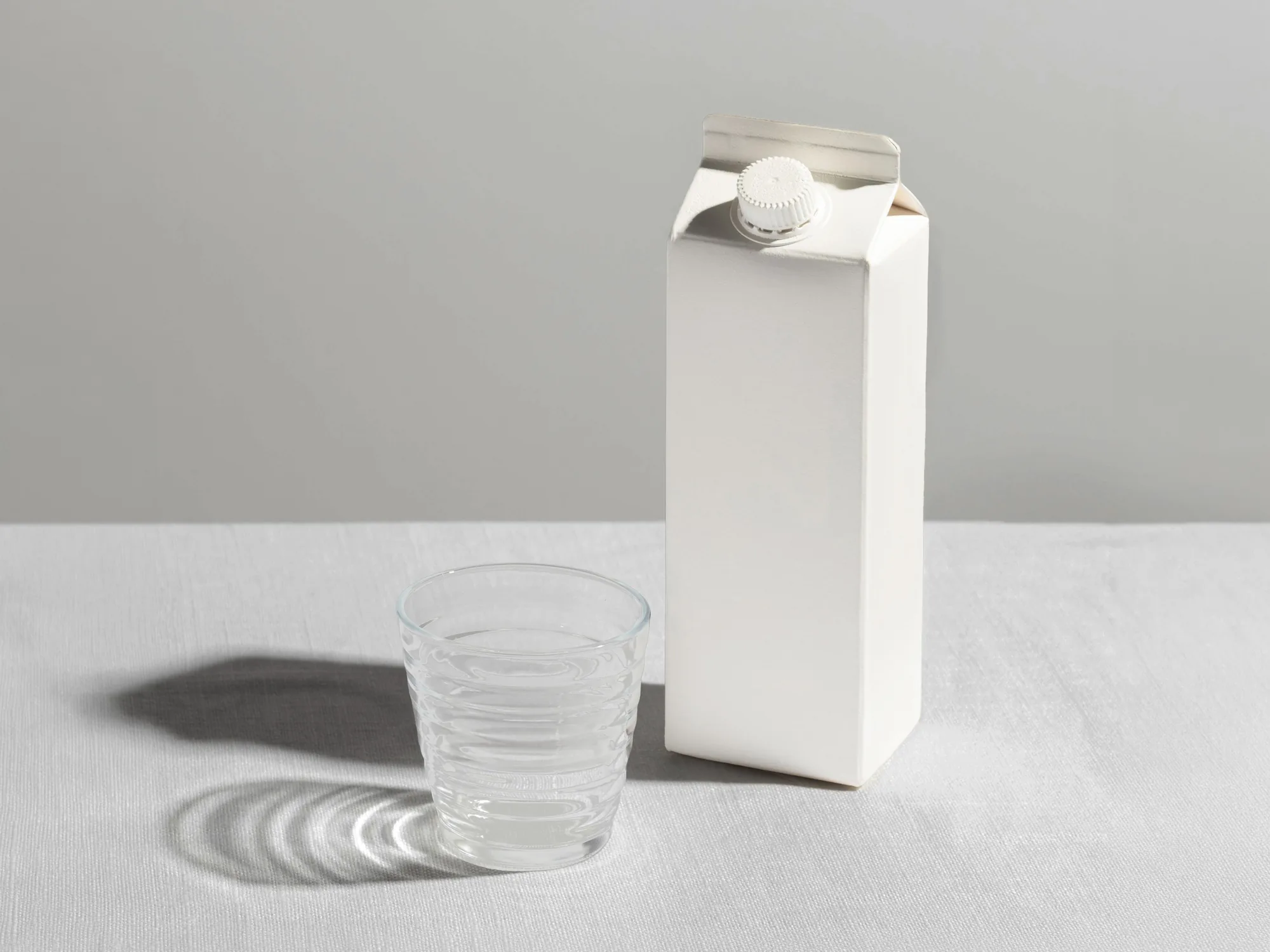
Every premium water bought its price with material: glass, aluminium, a heavy cap. We had a carton.
The reference that stuck was a Starbucks cup. Paper and disposable, and still carried into meetings without a second thought.
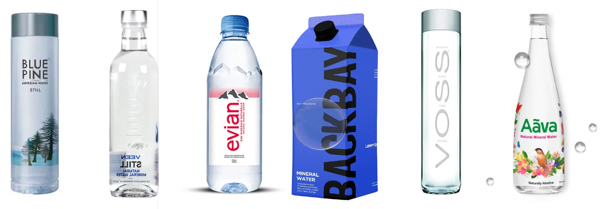
It didn't need to look expensive. It needed to be worth carrying.
The wordmark is Gotham with one edit, the A's cut so a wave runs under the letters, built to outlast the first product.
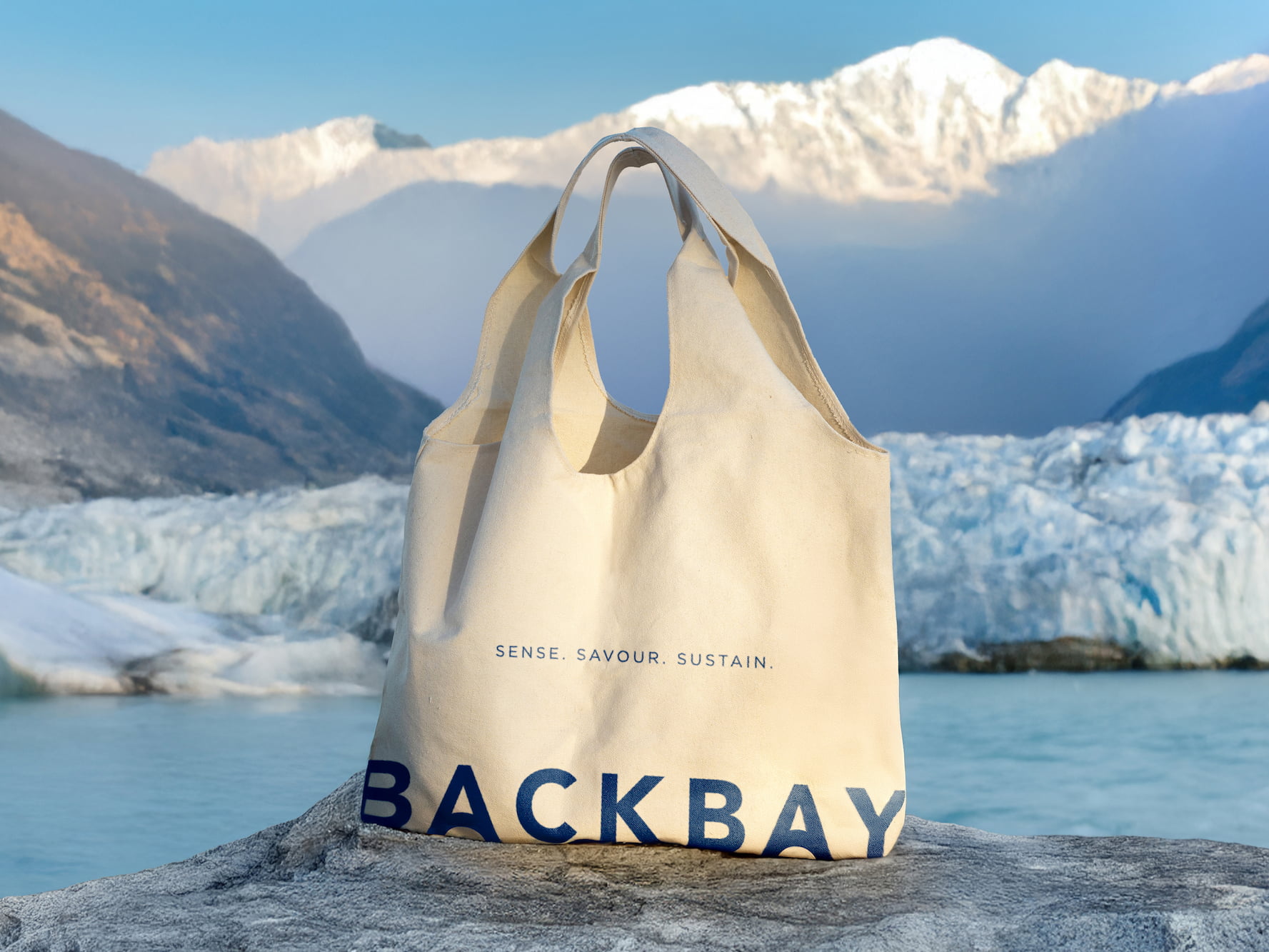
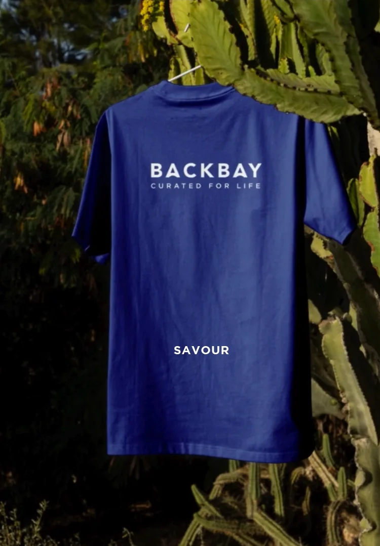
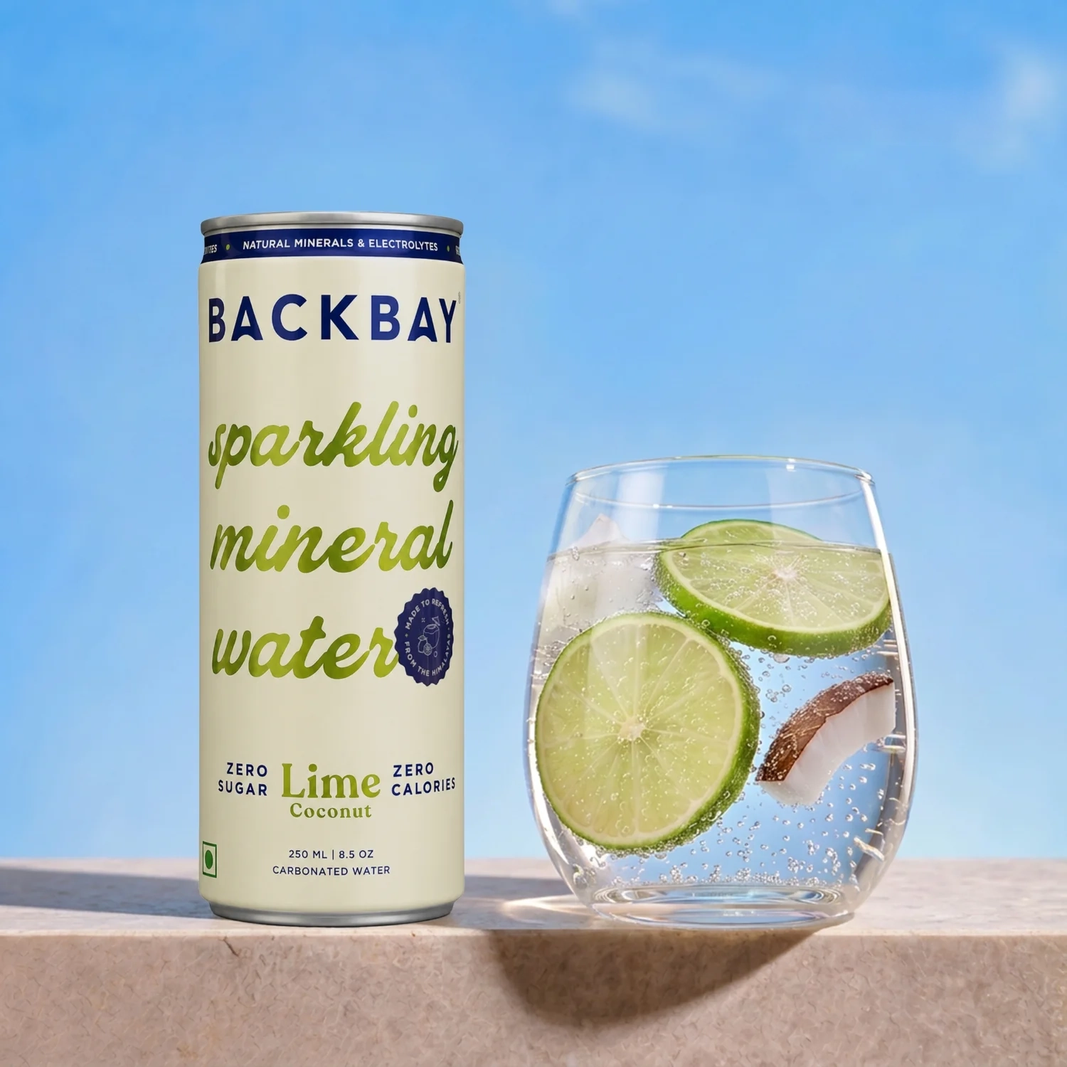
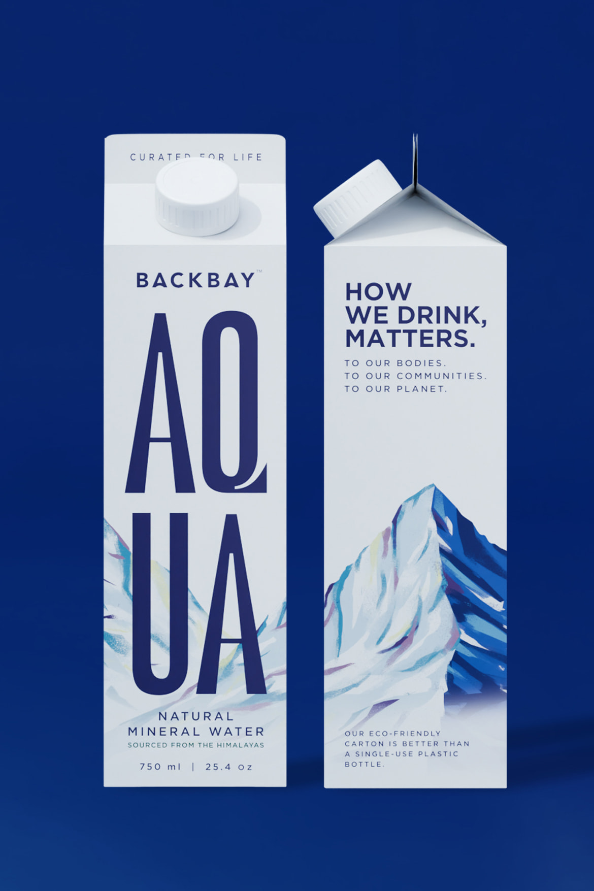
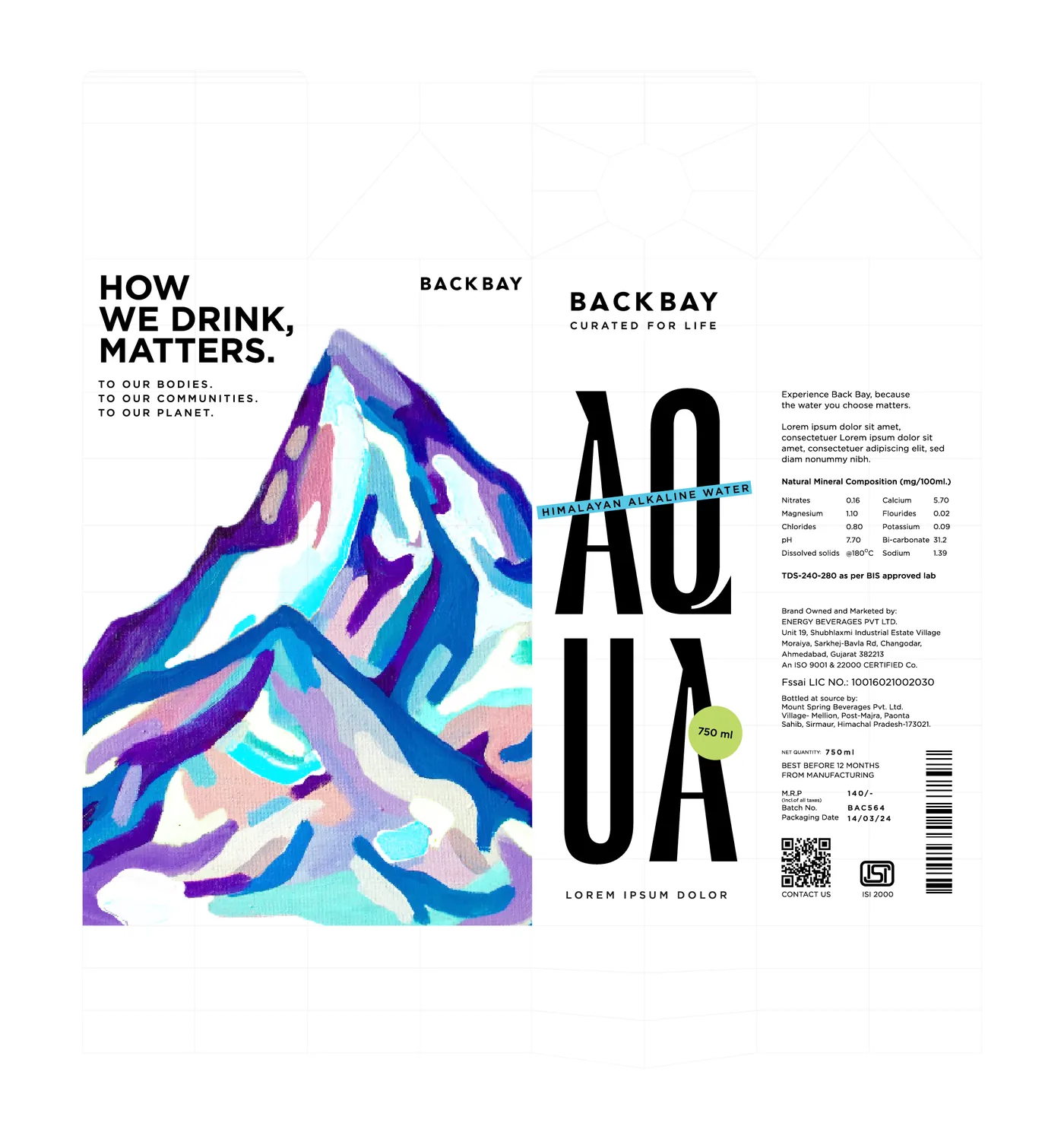
AQUA is stacked on the front so it still reads with two packs side by side. The mountains are painted, and get the whole panel.
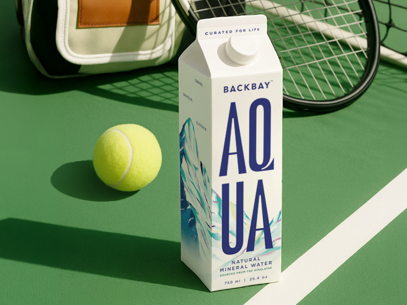
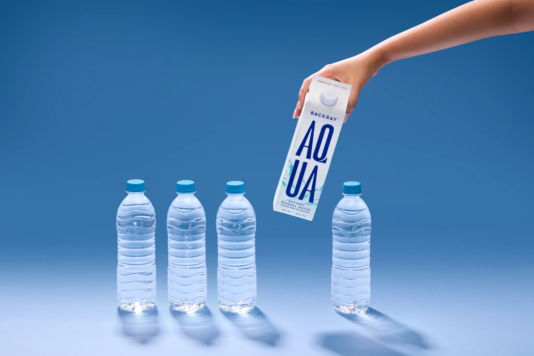
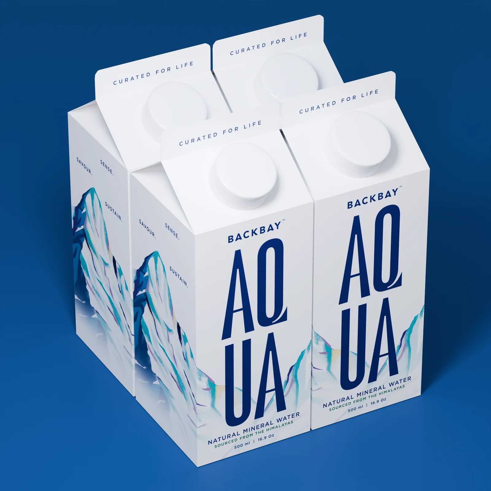
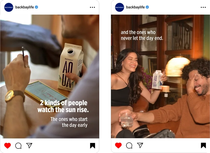
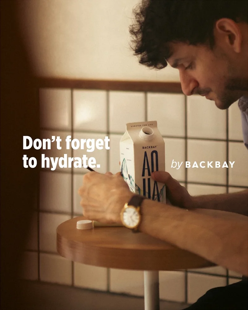
The launch film is built on the carton's outline. Whatever falls inside it is redrawn in the pack's painted world.
I set the direction from my read on premium design, drew the BackBay wordmark and created the stacked AQUA. I cracked the visual route in the design trials by bringing art onto the pack, and art directed the launch film. An illustrator painted the mountains, and the Creative Director made the final calls.
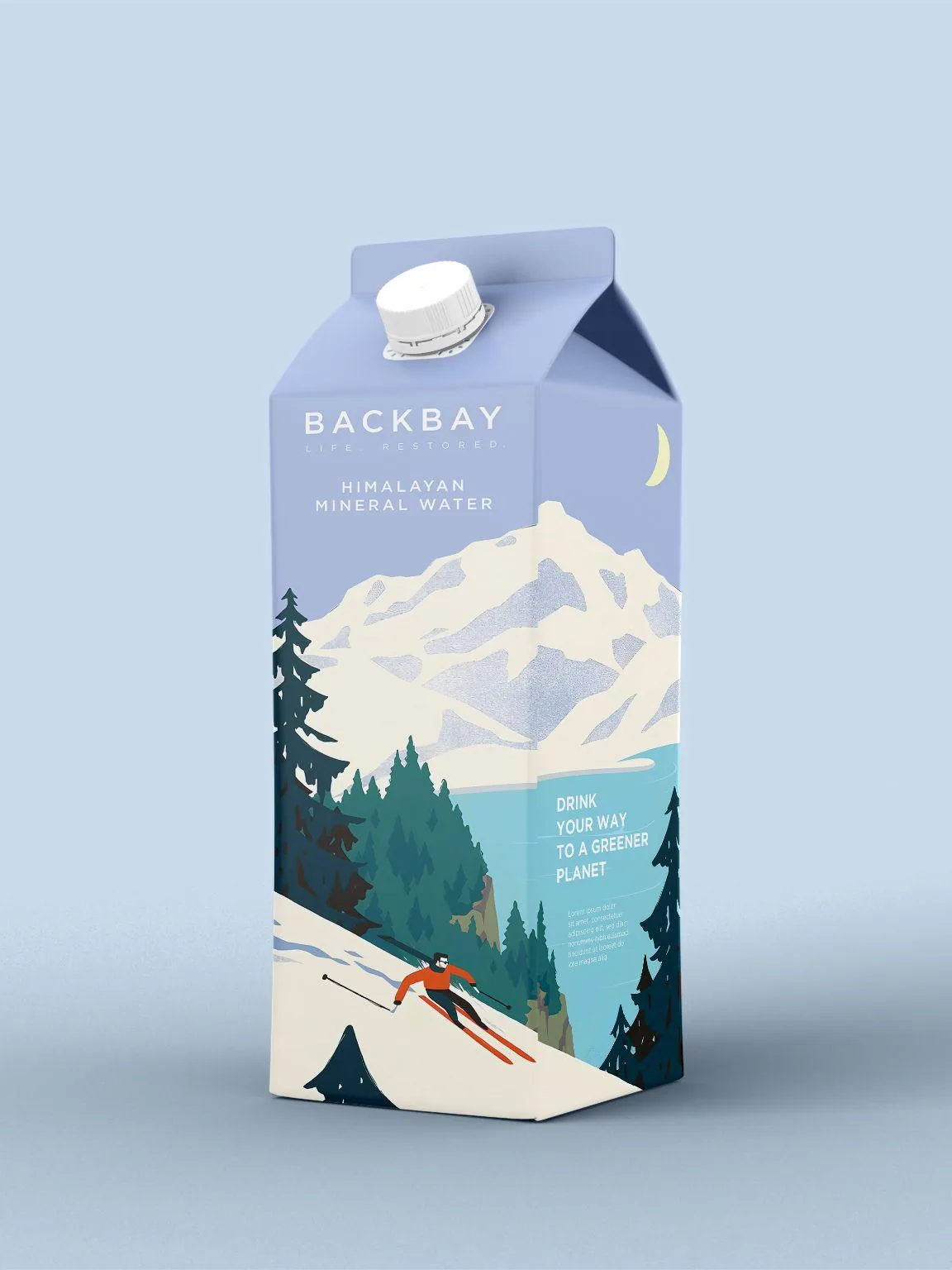
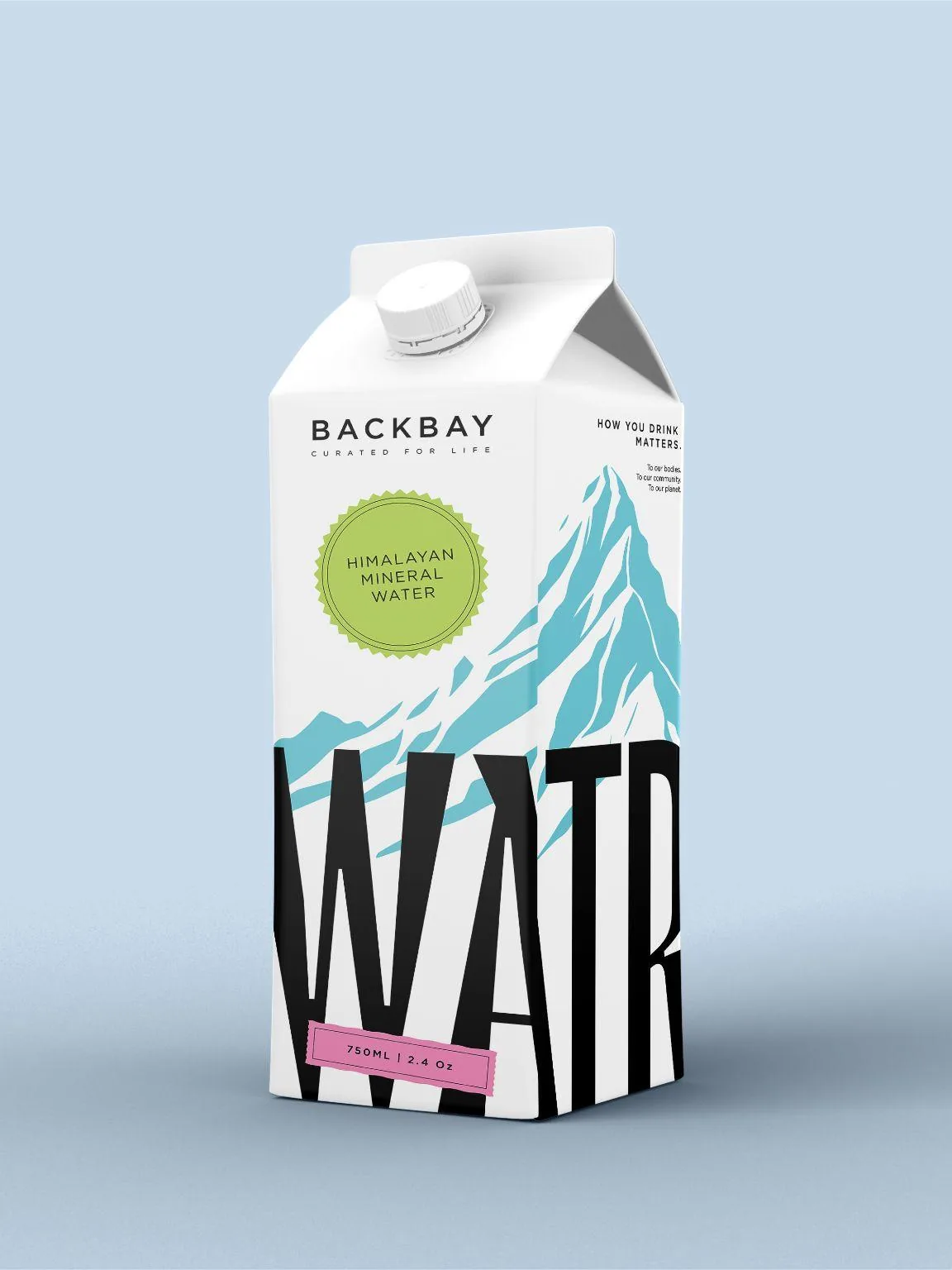
Three routes went in. The Creative Director backed a metallic finish, I backed stickers, and the founders chose an illustrated scene.
The scenes never landed. What worked was the sticker route's type with a painting on the panel instead. It won the sampling round.
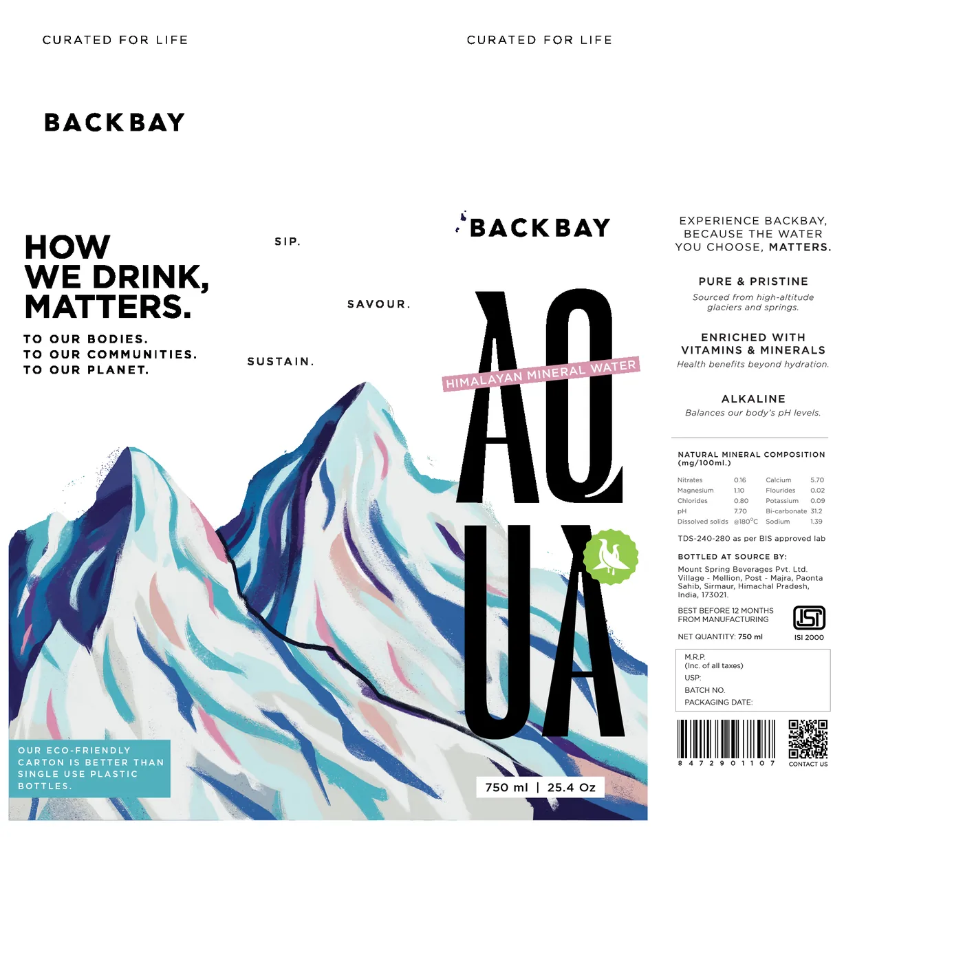
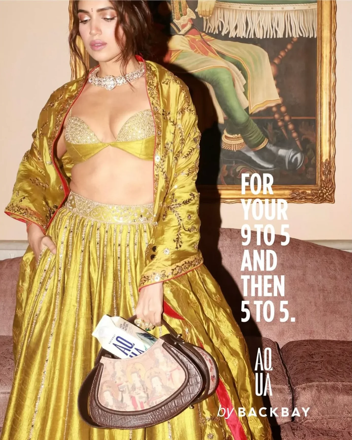
Live since August 2025, fronted by founders Bhumi and Samiksha Pednekar, from Nature's Basket to Blinkit, Zepto and PVR cinemas.
Self-funded, launched fourteen months after our handover on the identity as we left it, and now carrying a sparkling line.