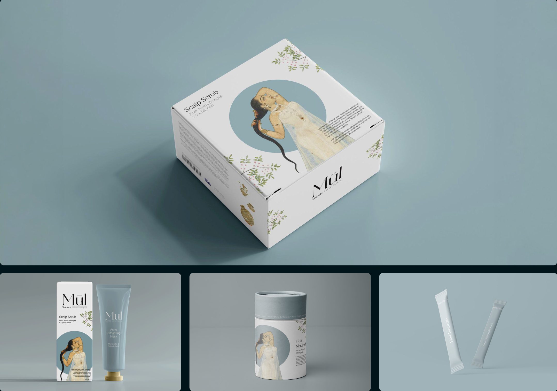
Self-care is as much internal as it is external. That is the principle Mūl was founded on, and their products speak the same language: topical applications and edibles that come together as one holistic solution for skin and hair care.
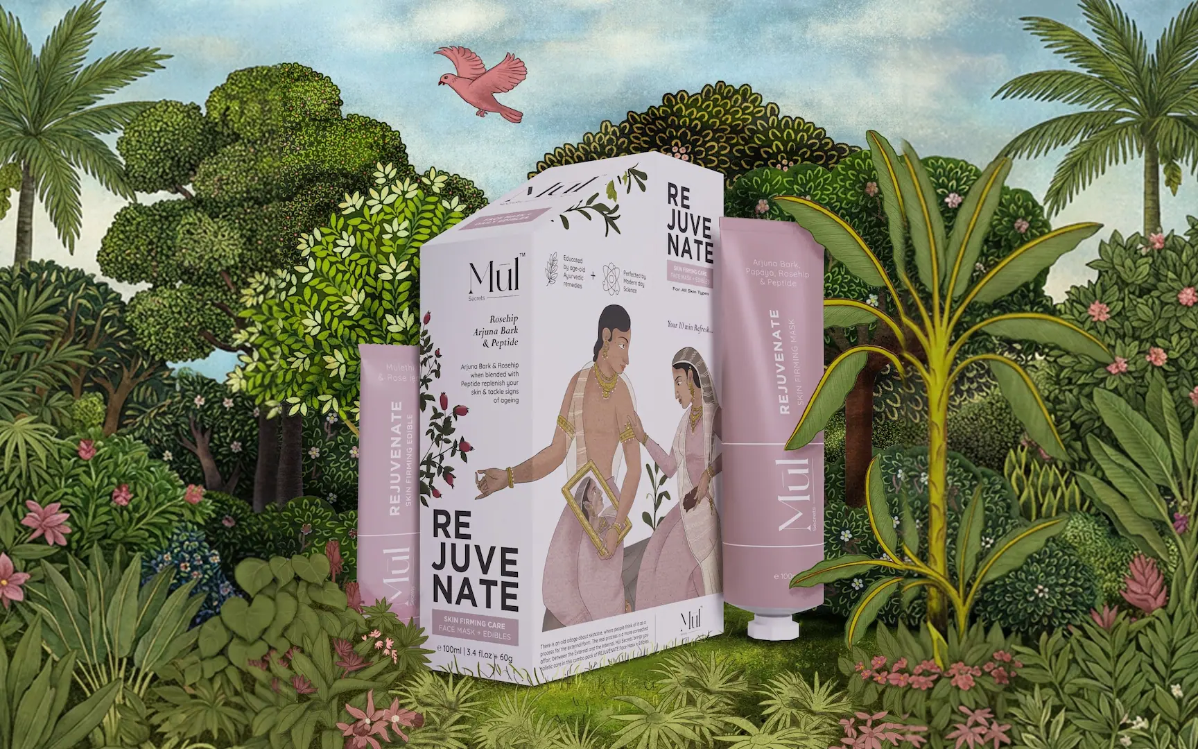
A skincare brand pairing age-old Ayurvedic remedies with lab-tested clinical formulations, sold as one unit: a topical cream and a month's supply of edibles, working from the inside out.
The ask was an identity and a primary box holding the tube alongside the edibles in secondary containers.
The name was locked. Mūl, Sanskrit for root.
Boxes within a box made one purchase feel like two, and either half feel optional.
To sit the products side by side, the primary box grew large and mostly empty.

The package had to make the internal cure and the external cure read as two halves of one solution, each incomplete without the other.
A uni-pack: two compartments made by folds, cut from a single sheet of card. The tube stands in the taller back half, the sachets sit under the slanted front, and the irregular profile is there to be noticed on a shelf.
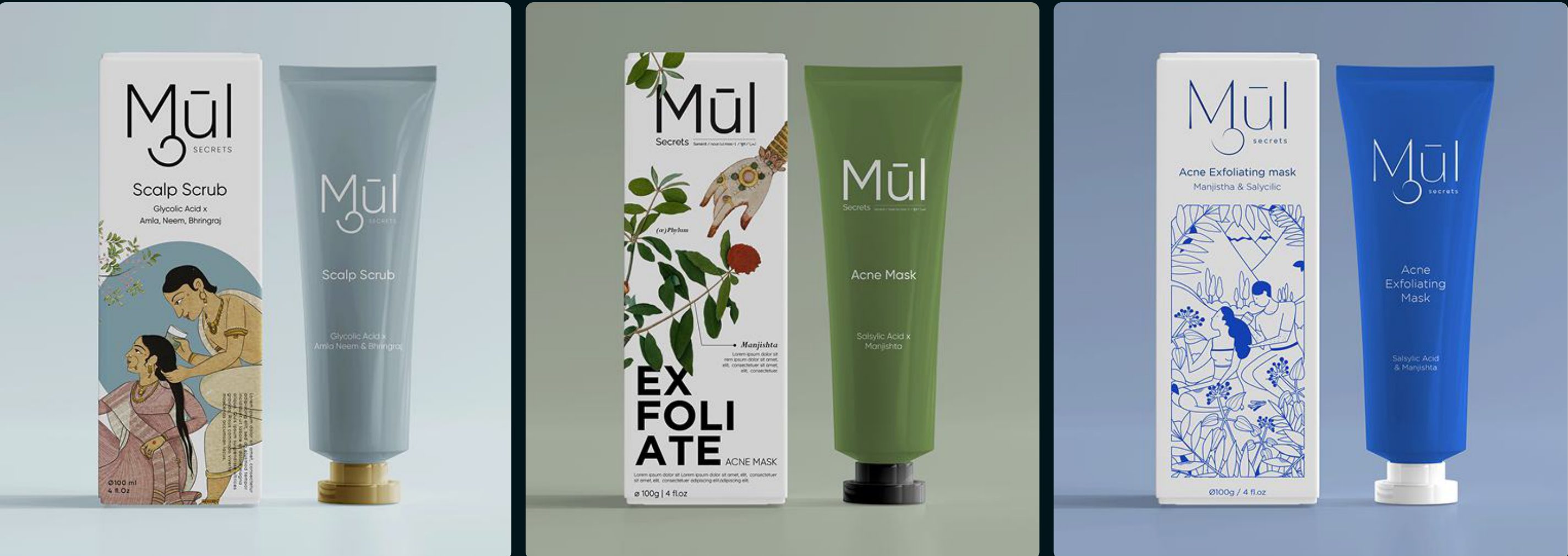
The illustration style sets Indian miniature painting against modern type, the old and the new in one frame.
I set the positioning, cracked the package structure design by using origami and set the visual direction. The team and I executed the identity design and created the packaging print files. Illustrators owned the illustrations and the Creative Director made the final creative calls.
The identity was explored as three complete worlds, each with its own value proposition, palette, typography and mood board.
"Deep rooted wellness" became the brand tagline, and came from combining two of the three.

The brand manufactures in India while its second largest market is the UAE. A single pack roughly doubled shipping capacity and saved 40% on shelf space.
The brand design film won Yellow Gold for Communication Design at White Square 2024. The clips on this page are from that film.