GM Syntex2023
Credibility,
given form.
Twenty years of reputation in textiles, built on quality alone, with no design language to show for it. GM Syntex asked Yellow for a rebrand that would claim dominance.
Twenty years of reputation in textiles, built on quality alone, with no design language to show for it. GM Syntex asked Yellow for a rebrand that would claim dominance.
A B2B textile manufacturer, twenty years in, exporting most of what it makes. The trade knew the name. Nothing about the brand said so.
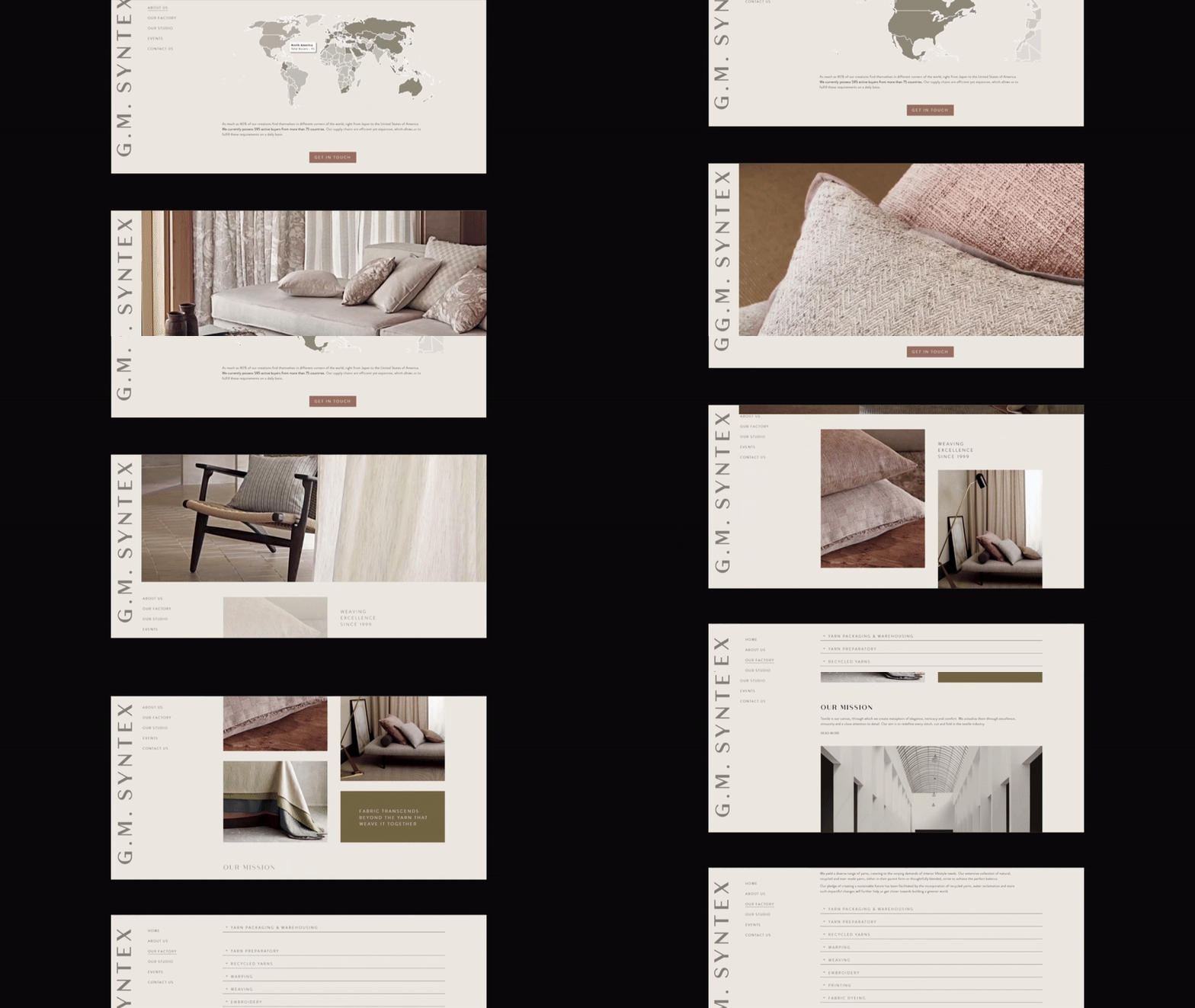
The ask was a rebrand that would claim dominance: identity, guidelines and a website.
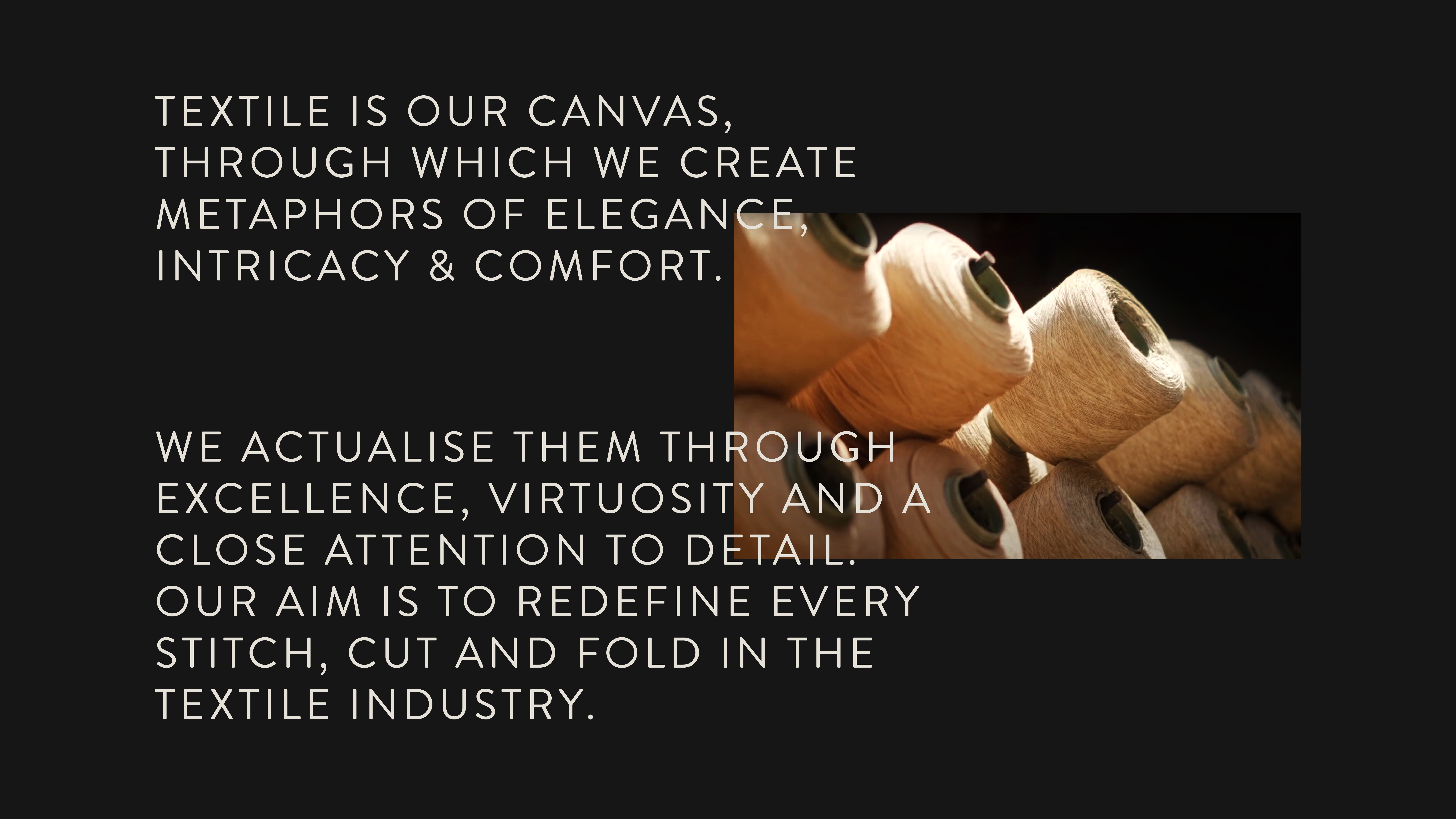
In the founder interviews, Dalbir kept coming back to one word: timeless. Not new, not cool.
They hadn't lost dominance. They had earned it.
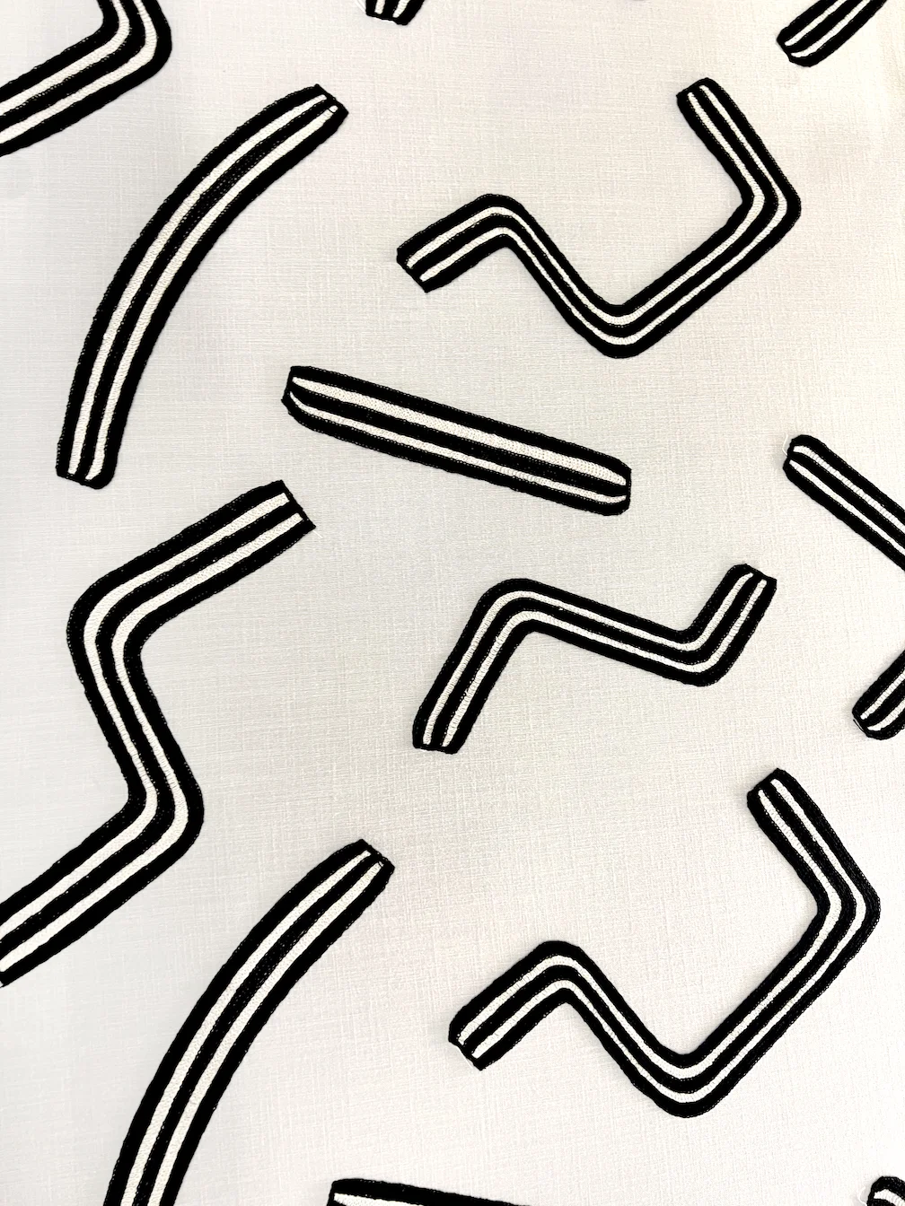
What was missing was visual form for credibility the trade already granted them. Give form to what's earned; don't announce an arrival.
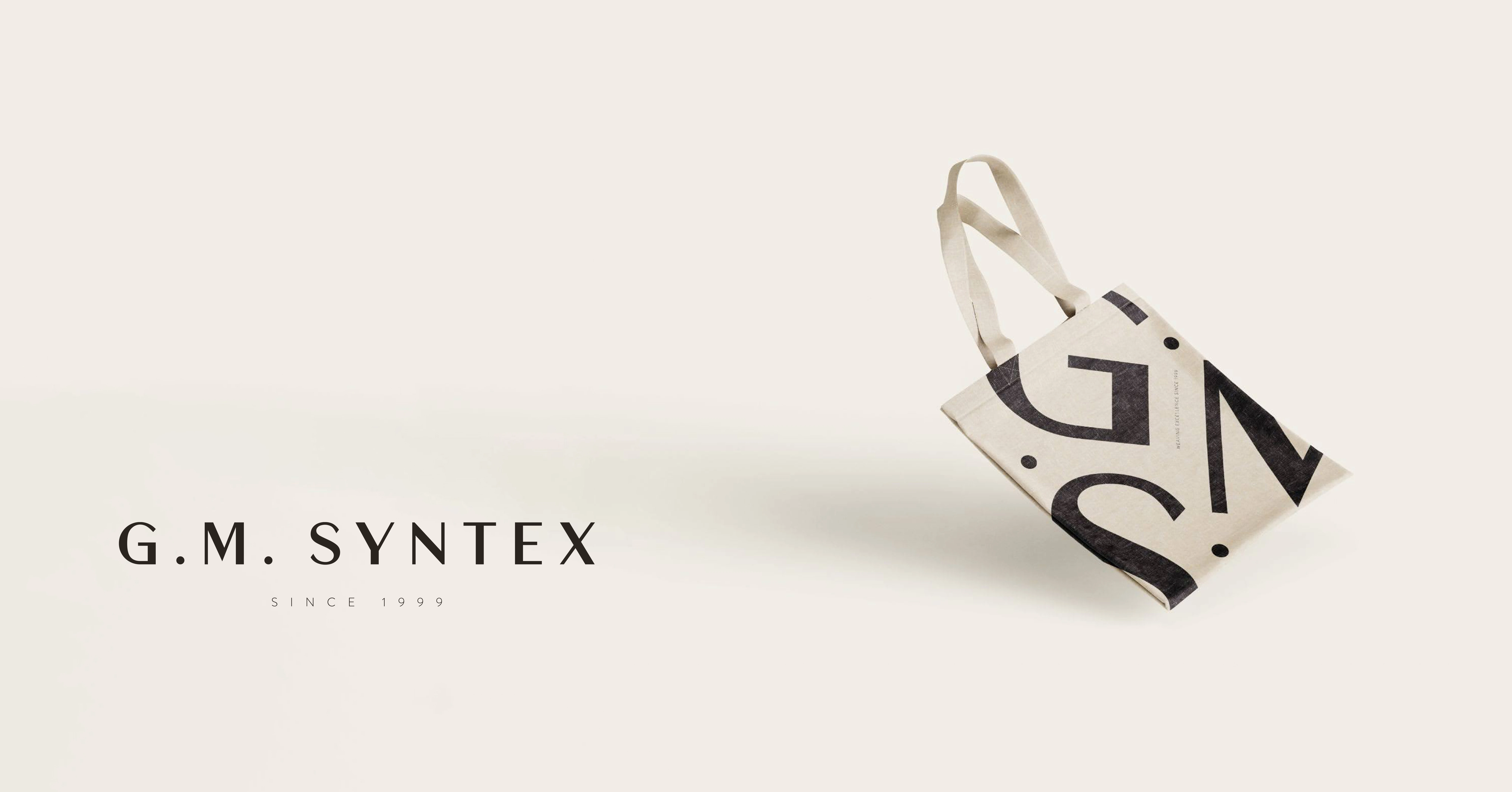
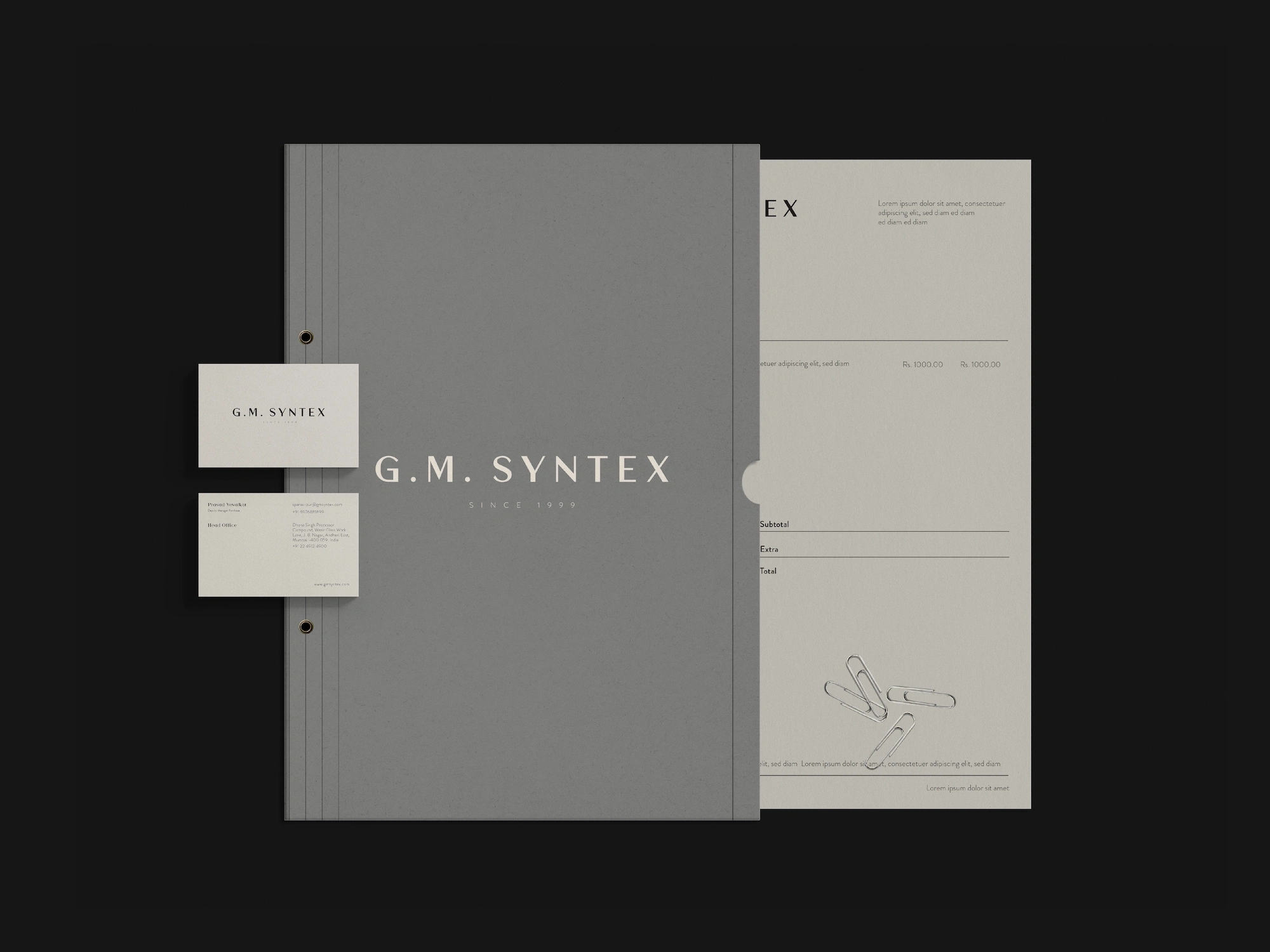
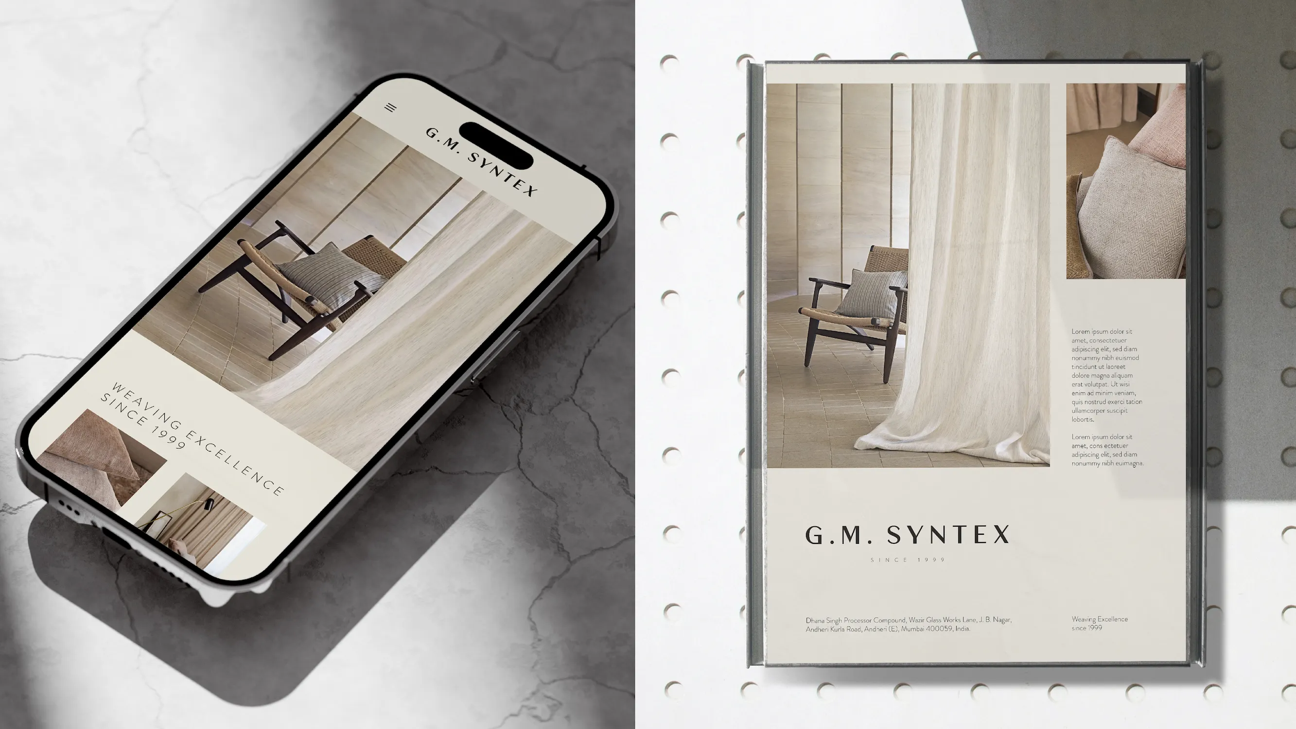
The positioning came first and drove every design decision. A visual system that holds from a business-card mark to a truck panel, and a swatch card, because that is where a textile brand actually meets its buyer.
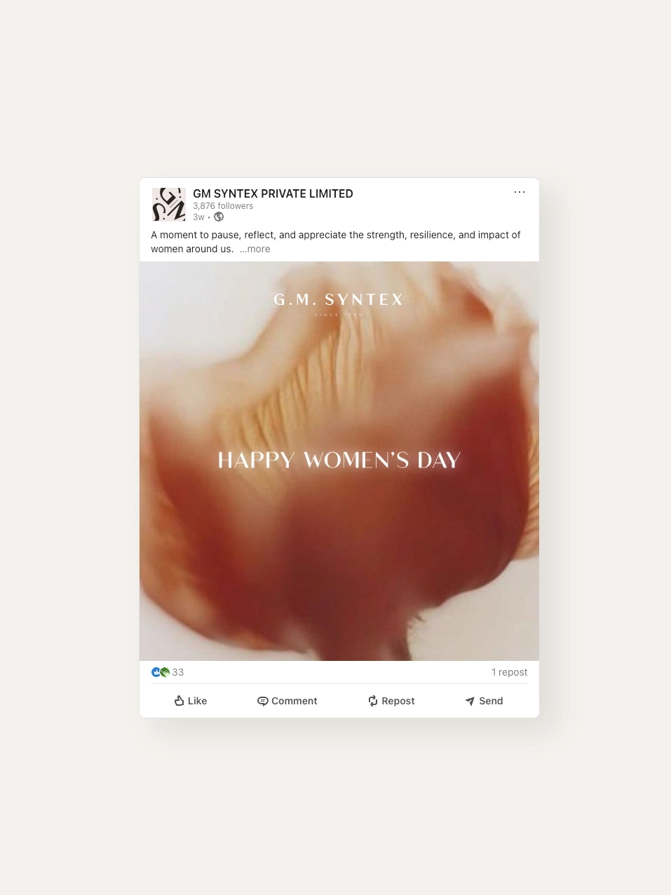
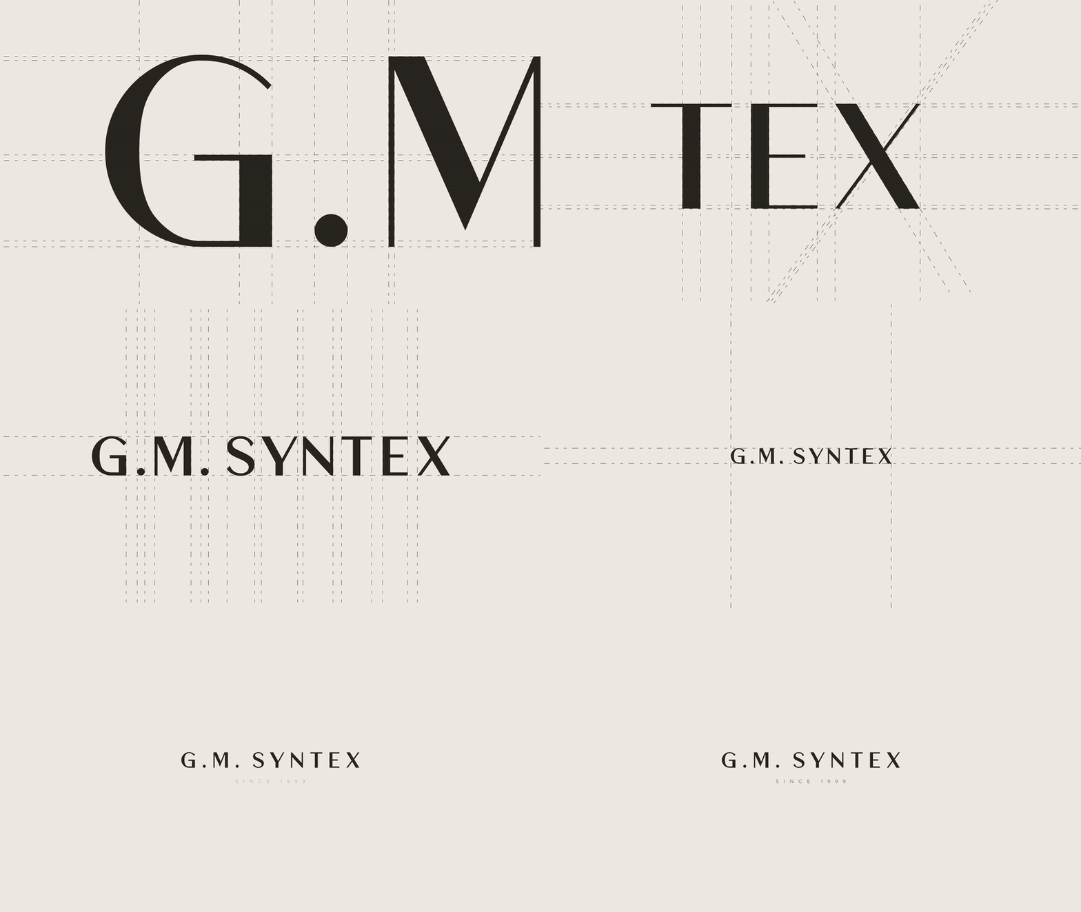
The wordmark and the monogram share a typeface, so either can carry a surface alone.

I set the direction and the moodboard, the team and I found the executions, and the Creative Director made the final creative calls.
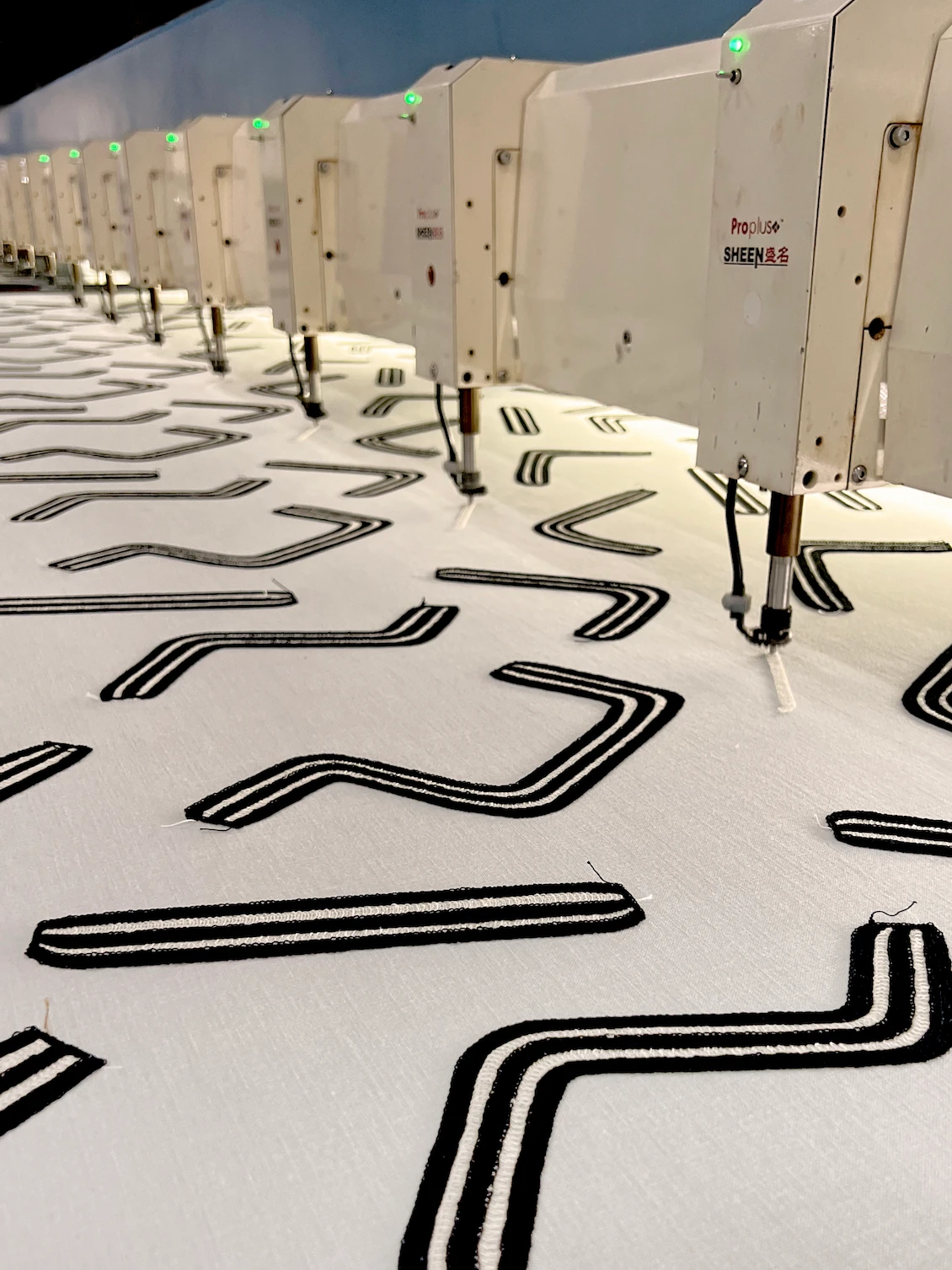
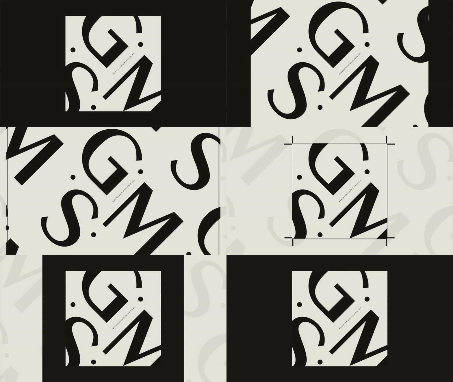
The visual route was stuck until a factory visit. On one of the embroidery machines a fabric with an abstract repeat was running, and the logic transferred: textile design works by repeating a motif and cropping it. The letterforms were built the same way, a pattern developed from the letters, then cropped like a swatch.
An earlier route had softened the letterforms to suggest fabric. The founder rejected it outright. No curves, nothing that reads as trying. That rejection is what settled the typography.
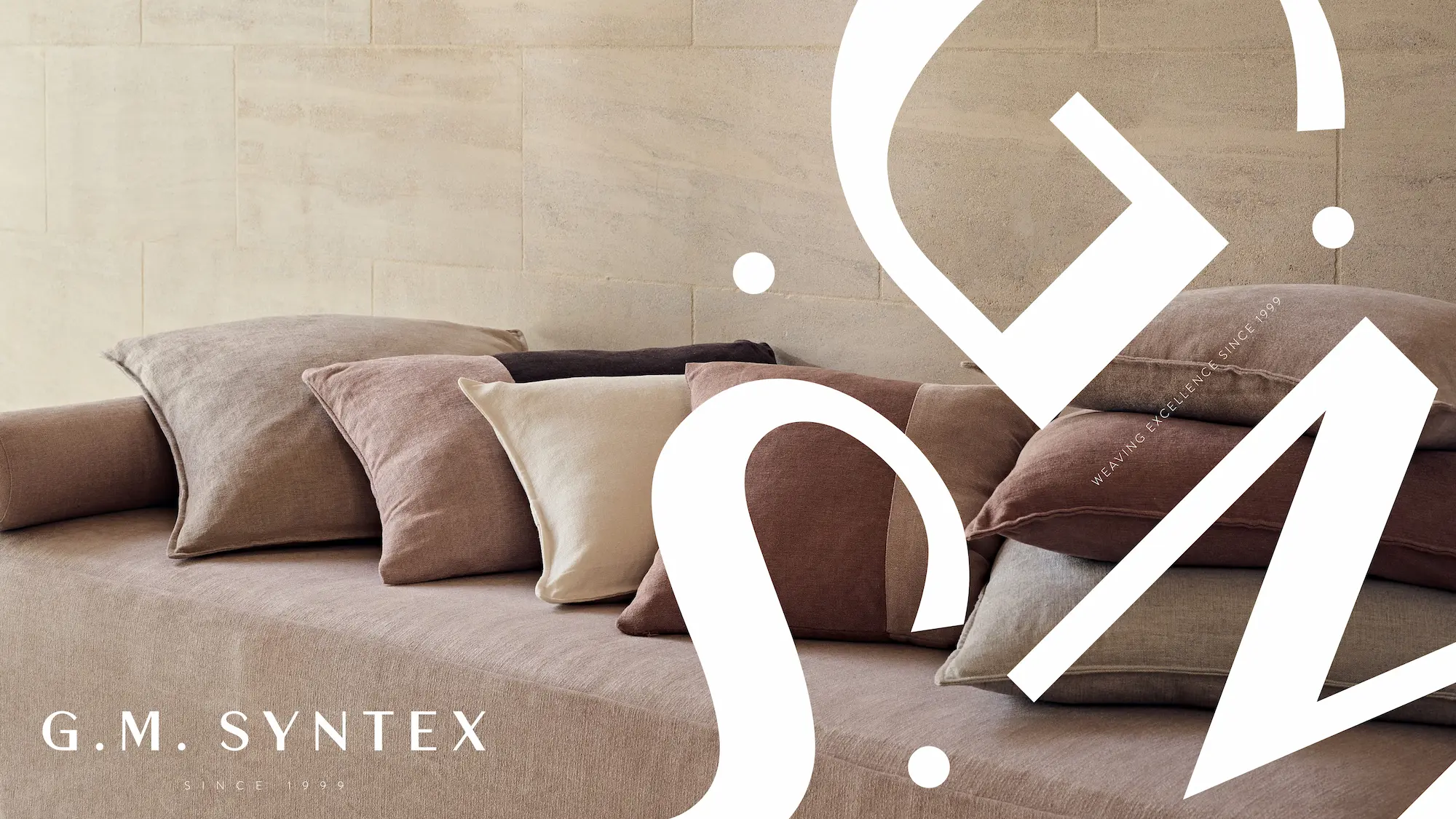
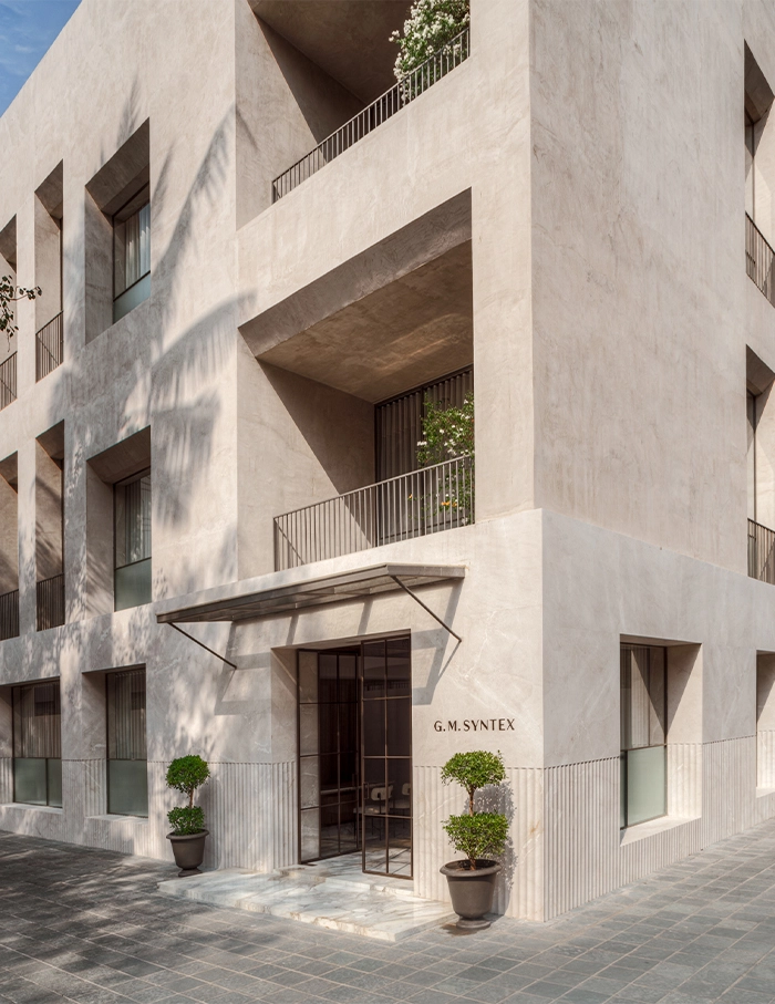
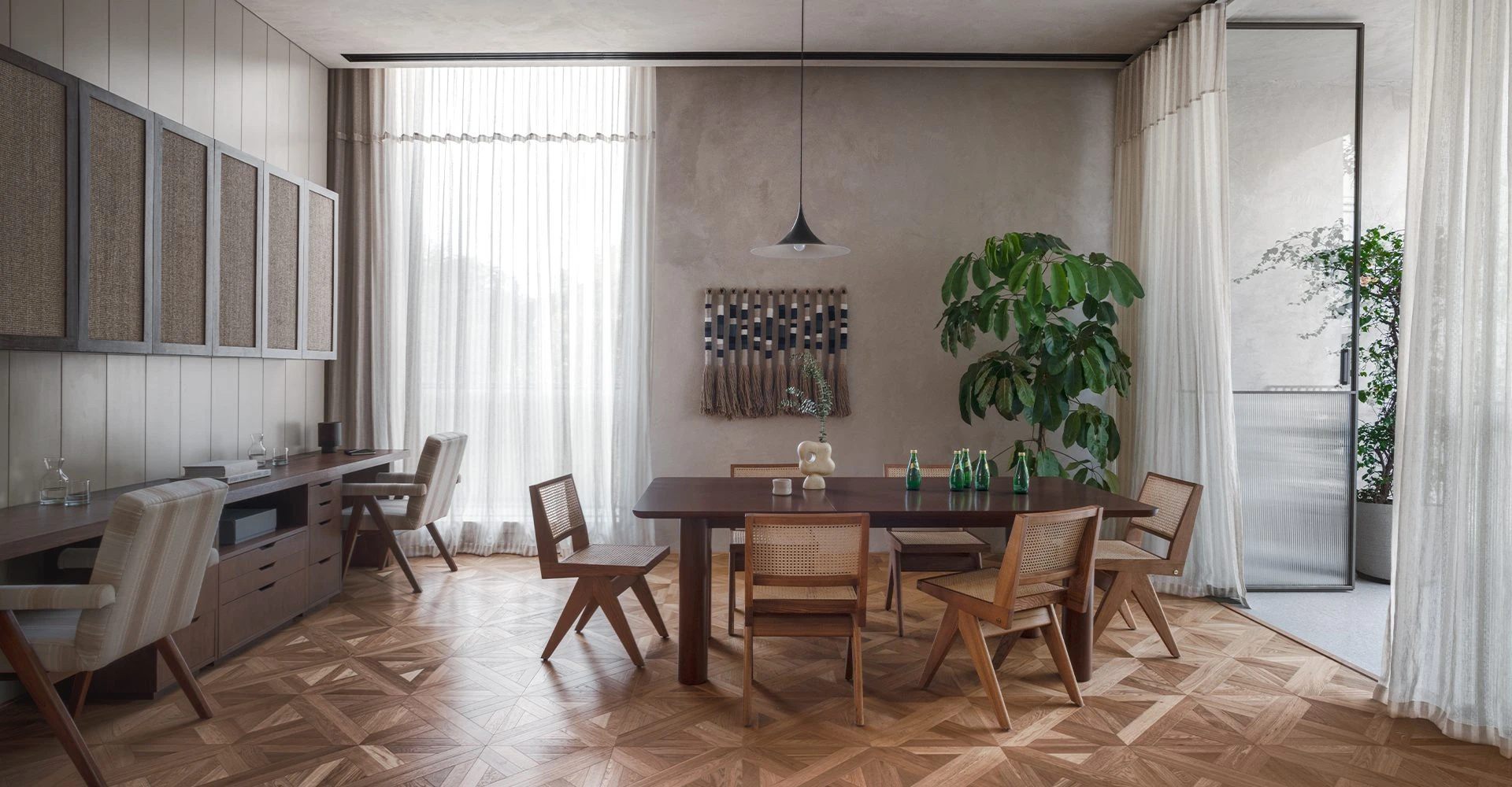
Seventy-five plus physical touchpoints since launch. A head office that opened months after the rebrand and became the brand's fullest expression. A first outing at Heimtextil, one of the world's largest home-textile trade fairs, in the B2B context the identity was built for.