VoiceCare2023

Healthcare is not
the care industry.

VoiceCare builds AI agents that take on healthcare's administrative grind: benefits verification, prior authorisations, claims. Yellow was briefed to build the brand it would go to market with, for an audience of hospital administrators and investors at once.

VoiceCare mark film
The brief

An AI company working in healthcare, about to launch an agent called Joy that people would speak to.

The brand had to carry tech-company confidence and healthcare-grade trust in a single identity, in a regulated industry where neither is optional.

The product is something you talk to. It had to sit on a home screen next to the other things you talk to.
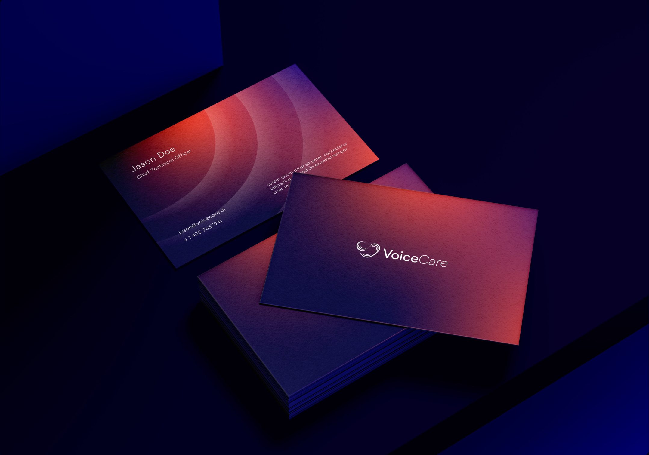
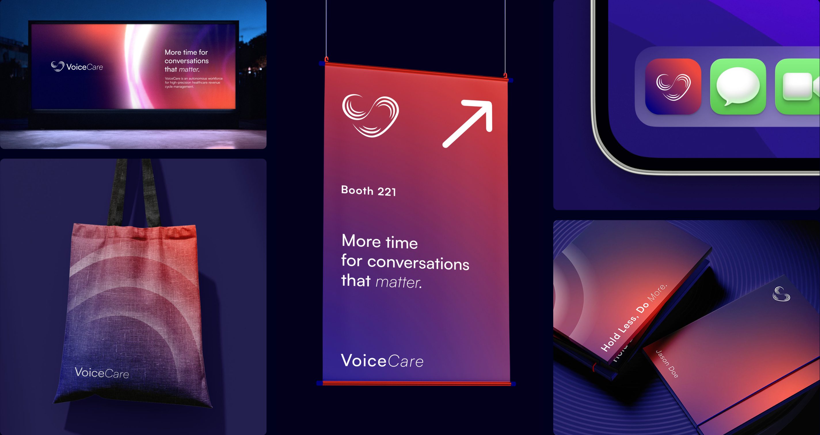
Business cards
The finding

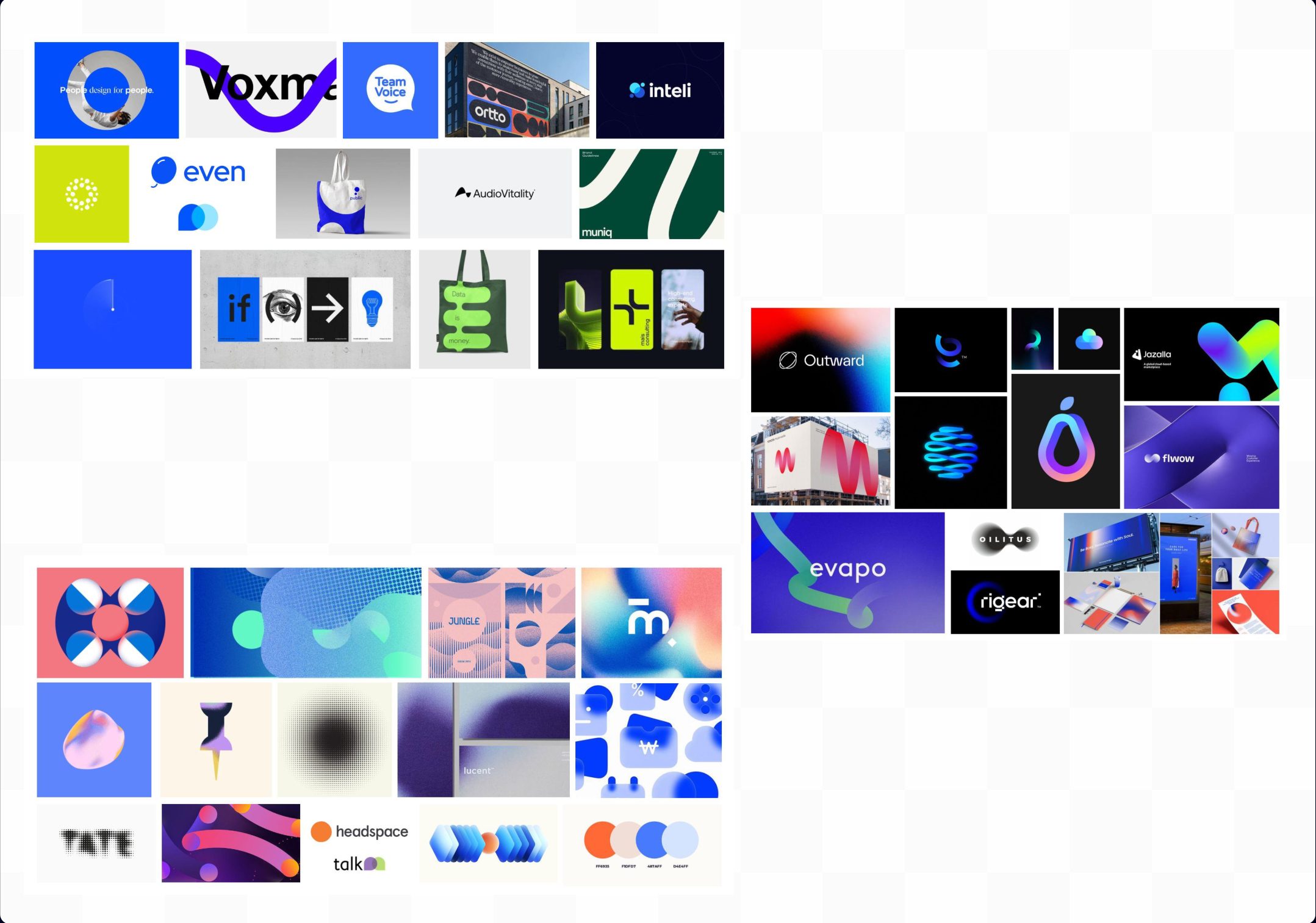
The team read it as health-tech and built the first moodboards accordingly. Sea moss greens from surgical scrubs, clinical whites, the visual language of the category everyone assumed this was.

The founder corrected the team on the first call and kept correcting. He could not describe what he wanted, but he almost immediately knew when something didn't work.

Three routes, one week in. Every brand on all three boards was a technology company.
Moodboards
Insight

Healthcare is not the care industry. This was a care brand with a voice interface, not a health-tech company, and every reference brought in was from the wrong shelf.

The work

The gradient went forward and the palette was rebuilt around the new reading: the charge of the technology at the extremes, softer mauves holding the care in between.

A designer on the team cracked the mark, a soundwave that resolves into a heart. Its final curves, weights and widths were set, the circular container it had arrived in was dropped, and the information architecture, interface and motion language followed from it.

The same system at opposite ends of the gradient. Technology at the extremes, care in the middle.
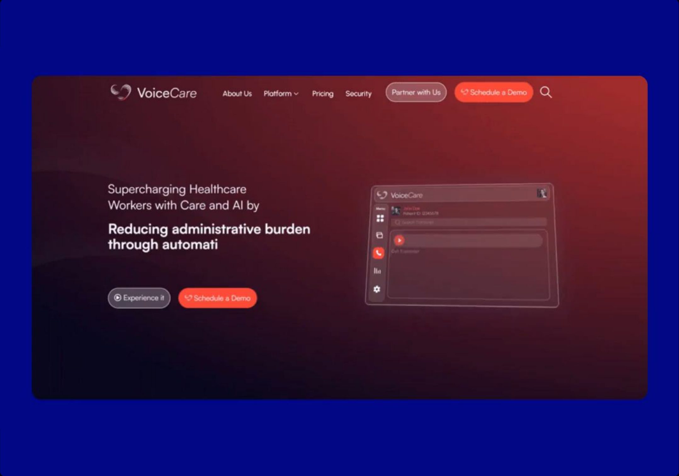
Website
Applications
My role

I led the strategy and the design direction, a designer on the team cracked the mark, and the Creative Director made the final creative calls.

The process

By the third round the team put six marks in front of the client. Five were waveforms, geometry and a spark. One was a heart.

The heart had been avoided because it is the most exhausted shape in care, and this could not look like every clinic in the world. The founder pushed the team to it, and he was right. The heart was only a cliché in the category the team thought it was in.

Needs the six-marks board (Meeting 3/New folder/1-07.jpg, VoiceCare working folder). This is also the missing deck slide.
The outcome

VoiceCare went to market with the identity and raised a $4.54M seed, led by Caduceus Capital Partners with Bread and Butter Ventures and the Mayo Clinic participating.

The brand is live at voicecare.ai.

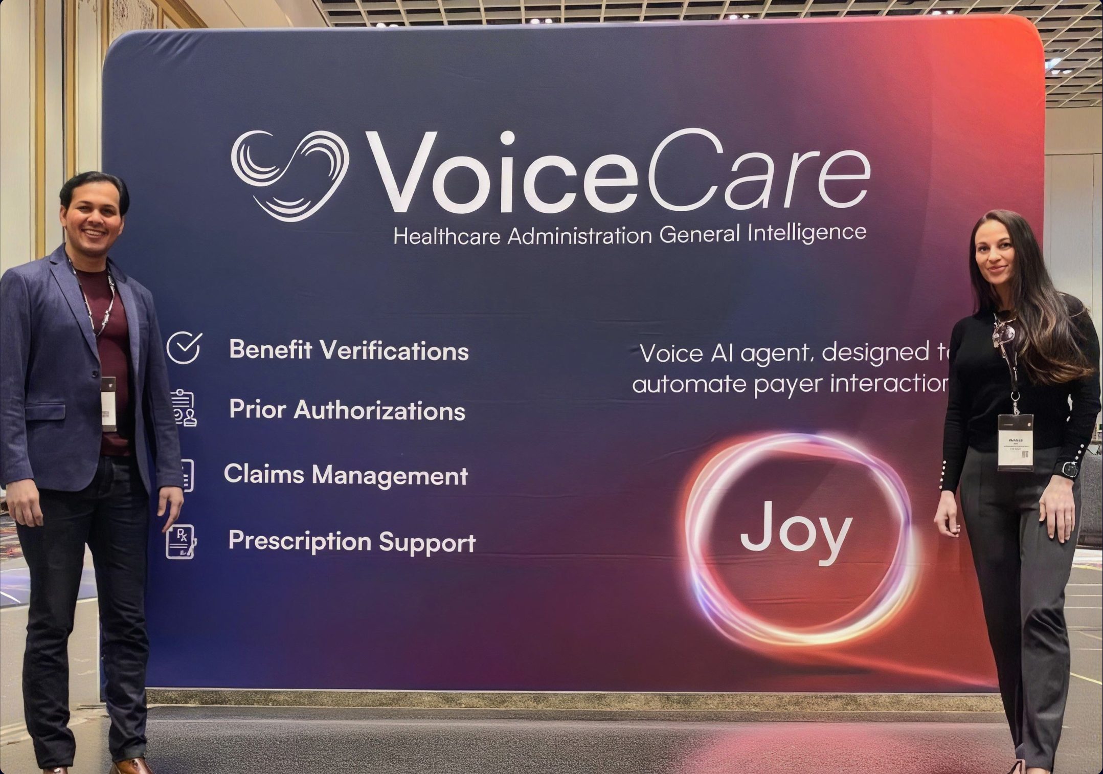
Booth
Links
Credits

More work

View All
Mul Secrets
Brand Strategy, Packaging and Art Direction
Fenty x Nykaa
Concept and Art Direction
Articurate
Research, Product Strategy and Design